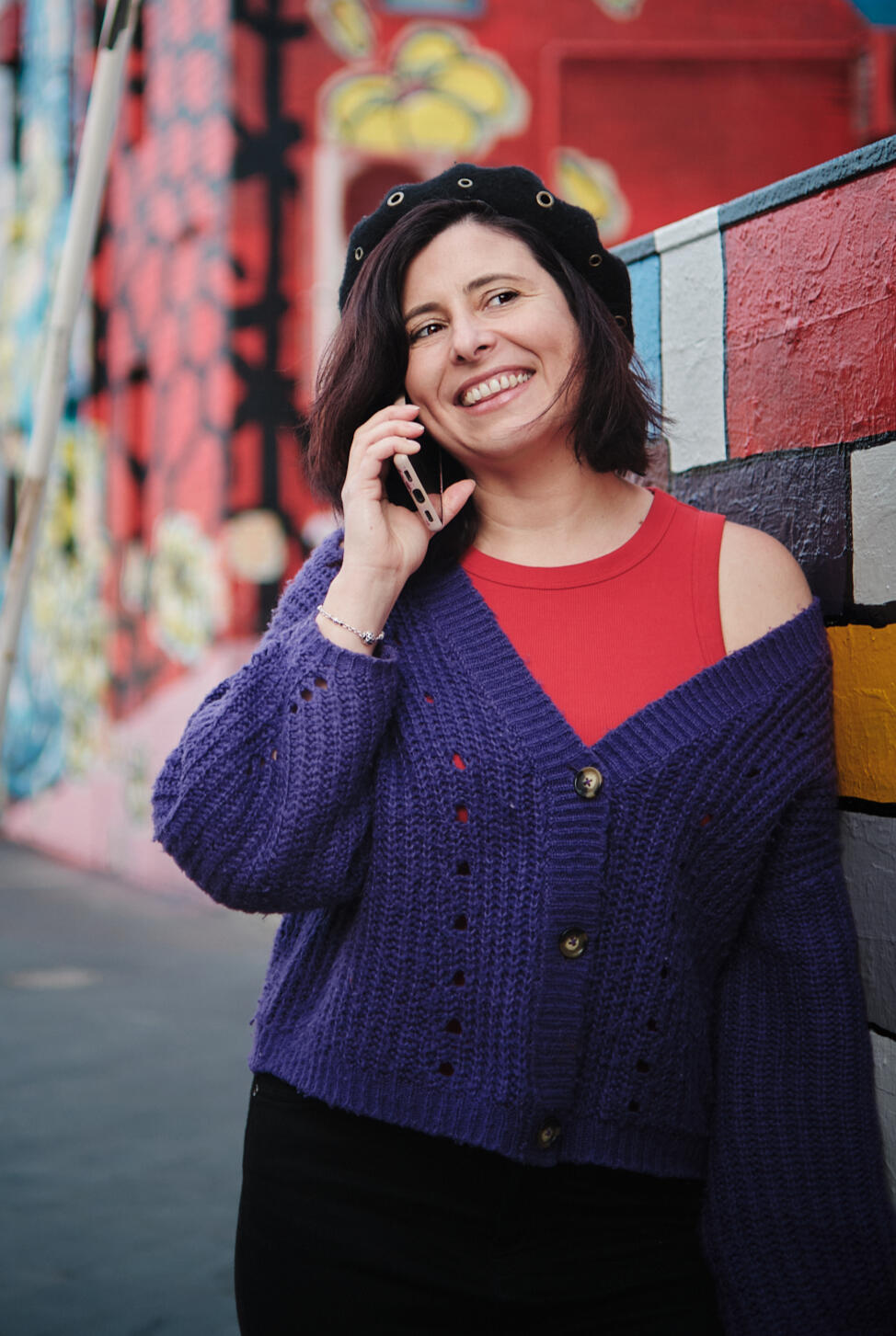
Hi,
I’m Nata.
Hi, I’m Nata.
I help women-led businesses and creatives build a digital presence as fabulous as their work.
Web design and brand identity — designed with you, not just for you.
I help women-led businesses and creatives build a digital presence as fabulous as their work.
Featured Work
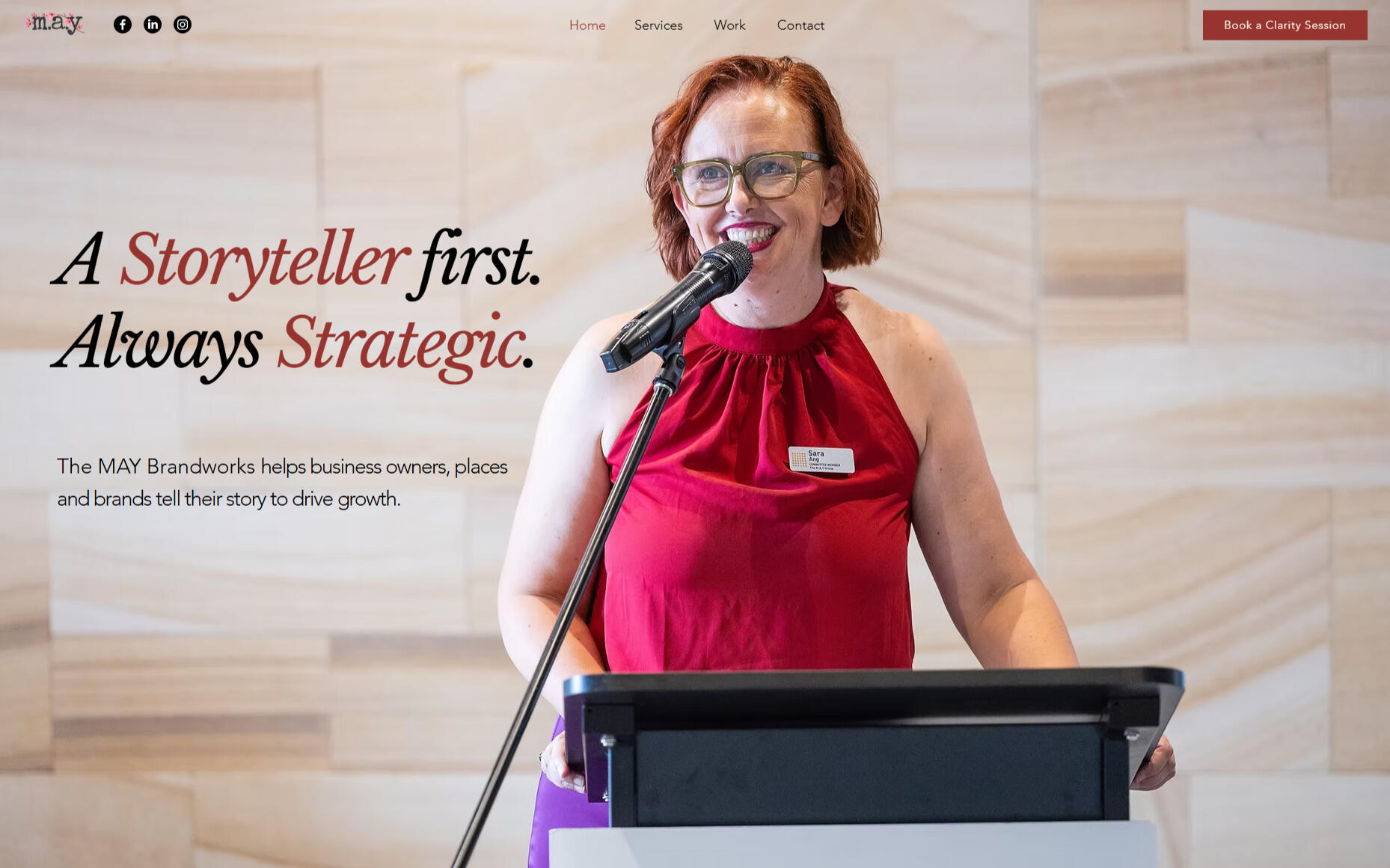
The MAY Brandworks — Landing Page
A premium landing page designed to attract high-value clients and let the work speak for itself.Blending editorial design with strategic structure to create a digital presence as considered as the consultancy itself.
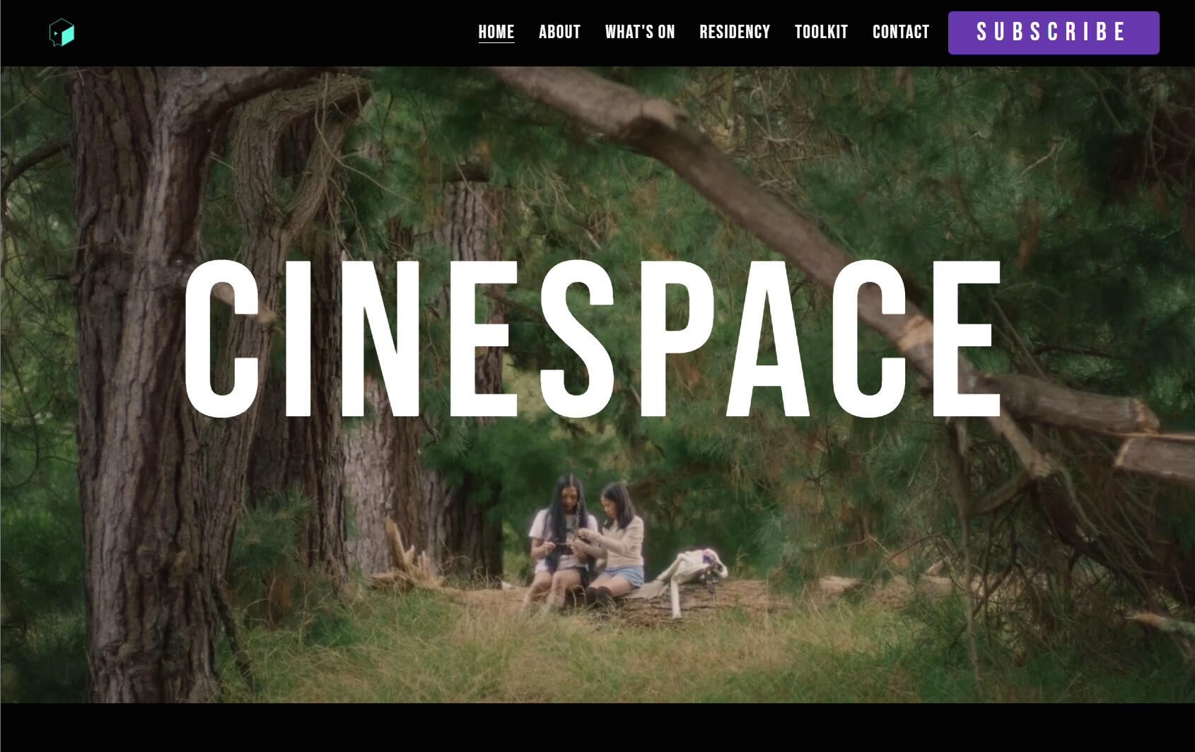
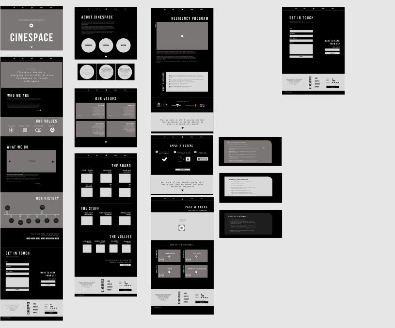
Cinespace Inc —
Website Redesign
A complete redesign to elevate brand perception and create a more cinematic, user-focused experience.Designed to better showcase their work and guide users seamlessly across their multiple programs.
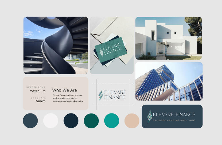
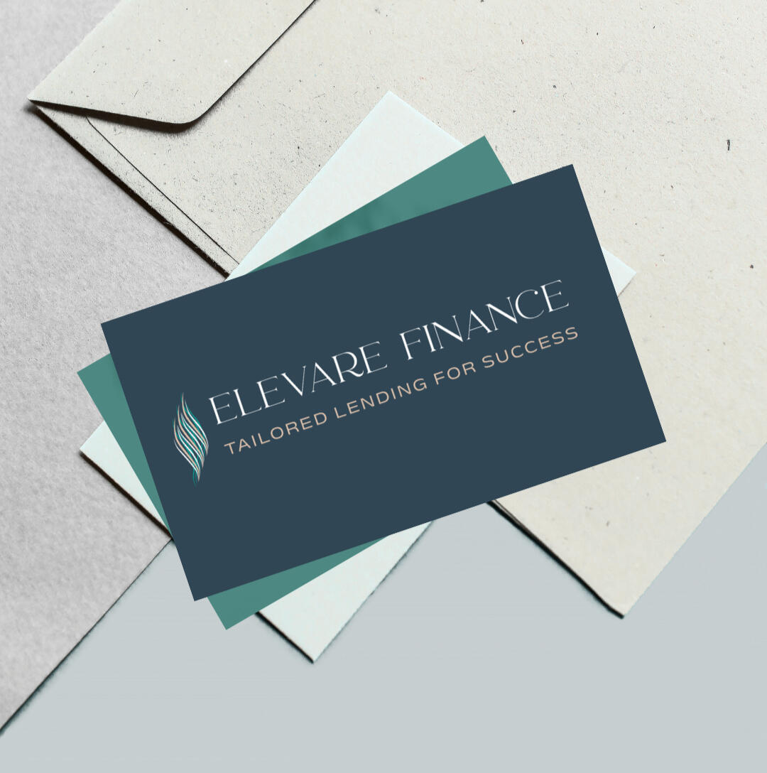
Elevare Finance —
Brand Identity
A calm, confident visual identity designed to build trust and bring clarity to financial decision-making.Positioning the brand as both trustworthy and approachable in a traditionally complex space.
What Clients Say
💬
"Natalia completed a website build as part of our wider rebranding project for Cinespace. She was instrumental in leading, coordinating and bringing our vision to life. Her expertise carefully navigated visual design, user experience and effective communication of our story and has resulted in our stunning website today. "PAULINE PHAM, CINESPACE
💬
"Nata has been an absolute delight to work with. Despite my limited direction, Nata worked tirelessly to bring possibilities to life through thoughtfully curated mood boards, themes, logos, and design concepts. She transformed ideas I couldn’t articulate into a cohesive, beautifully crafted vision."TRAN LE, ELEVARE FINANCE
💬
“Nata has an extraordinary ability to reach into the heart of an artist's vision and draw out the perfect colour palettes, fonts, and UX flow to communicate with an audience in the way that truly matters.I could not recommend her more highly.”SARA ANG, THE MAY BRANDWORKS
What I do

Website Design
Strategic, high-impact websites designed to position your brand and convert.
.

Brand Identity
Thoughtful visual identities crafted to bring clarity and confidence to your brand.
.

Landing Pages
Focused, conversion-driven landing pages built to engage and drive action.
.

Design Collateral
Print and digital collateral that keeps your brand consistent everywhere.
.
Let's turn your vision into a memorable digital experience.
What I do
Website Design
Strategic, high-impact websites designed to position your brand and convert. From structure to visuals, every decision is intentional—so your site doesn’t just look good, it works.
Scope includes:
• Page strategy & structure
• Wireframing
• Conversion-focused design
• Website audits, redesigns & refreshes
• Design & build
• Copy guidance
Brand Identity
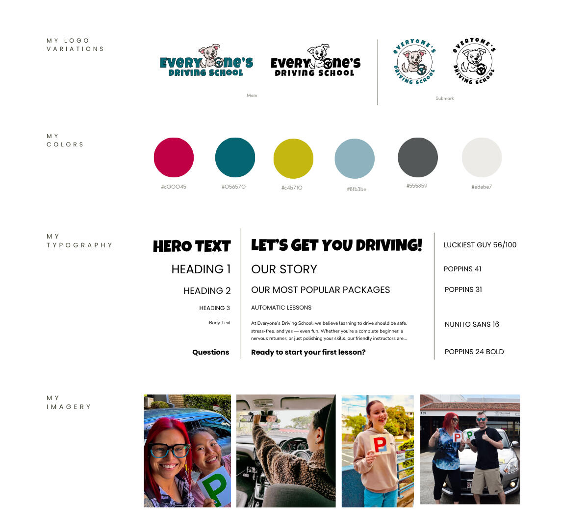
Thoughtful visual identities designed to bring clarity and confidence to your brand. A cohesive system of type, colour, and direction that feels aligned—and instantly recognisable.
Scope includes:
• Logo design
• Typography & colour systems
• Brand direction & visual language
• Brand guidelines
• Imagery sourcing and photoshoot guidance
• Icon & illustration direction
Landing Pages
Websites that reflect your brand from the inside out. Built around your goals, your audience, and the experience you want people to have.
Scope includes:
• Page strategy & structure
• Wireframing
• Conversion-focused design
• Copy guidance (light)
• Design & build
• Campaign or launch pages
Brand Collateral
Assets that support your brand beyond the website. From pitch decks to business cards, every piece is designed as part of a cohesive brand experience.
Scope includes:
• Presentation & pitch deck design
• Flyers & promotional materials
• Posters & event graphics
• Brand collateral (business cards, letterheads)
• Social media templates
• Print-ready file preparation
How I work
01 — We define your brand and your business goals
We define your goals, audience, and direction—so the final result reflects who you are, not just what you offer.

.
02 — We shape a visual direction that feels like you
We translate your vision, voice, and tone into a visual language you recognise and feel confident sharing.

.
.
03 — I design the experience before it’s built
I take it from here to design the website in Figma first, defining structure and user flow before moving into development.
.
.
.
04 — I build, deliver and hand over with clarity
I build your website desktop-first, optimise for mobile, and hand it over in a way that's easy to manage and update.
Investment
I work on a limited number of projects at a time to ensure a thoughtful, collaborative process and consistently high-quality outcomes. Each project is tailored to your needs, with timelines and investment shaped by scope and complexity.Below is a general guide to investment and timelines.
Website Design & Build
Strategic, well-structured websites designed to elevate your brand and support growth.
4-6 Weeks
$1,500 — $4,500
Brand Identity + Website
A cohesive brand and website designed together for a clear, confident and aligned presence.
6-8 Weeks
$3,000 — $6,000
Landing Pages
Focused, conversion-driven pages designed to communicate clearly and drive action.
2-4 Weeks
$1,250 — $2,500
Brand Collateral
Ongoing or one-off design support across digital and print.
Timeline varies by scope
CUSTOM PRICING
Every project is unique — like every client.
What stays the same is how we get there.
Let’s create a digital presence that reflects your brand.
Selected Work
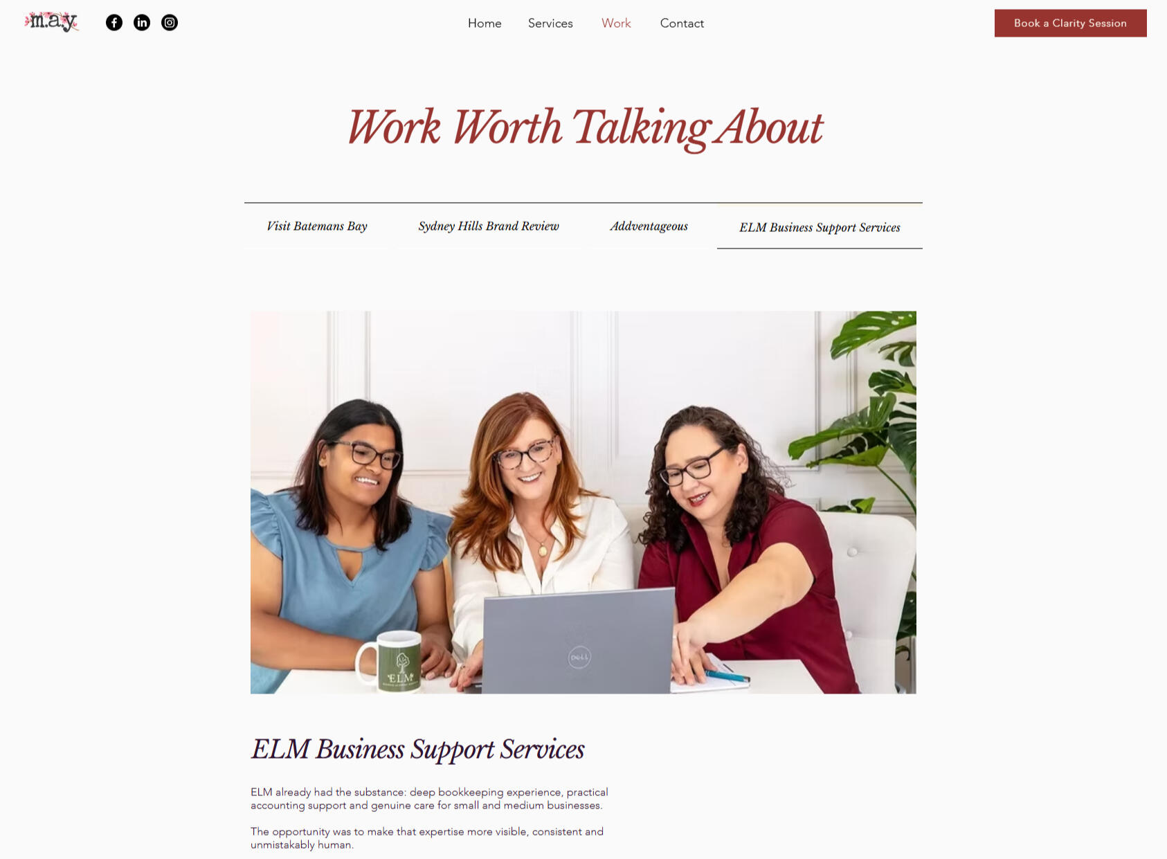
The MAY Brandworks — A marketing consultant landing page
.
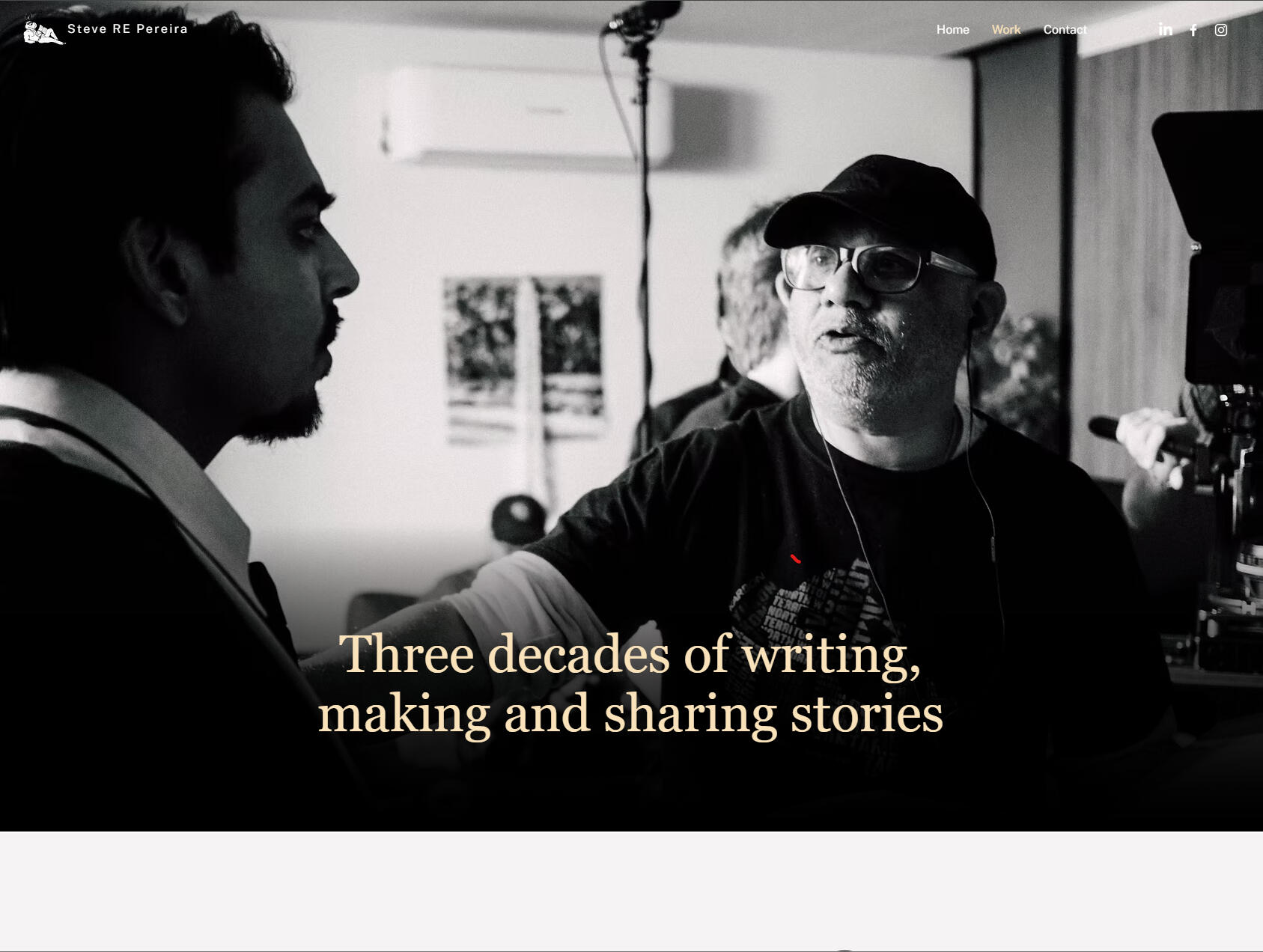
Steve RE Pereira — Creative Portfolio Redesign
.
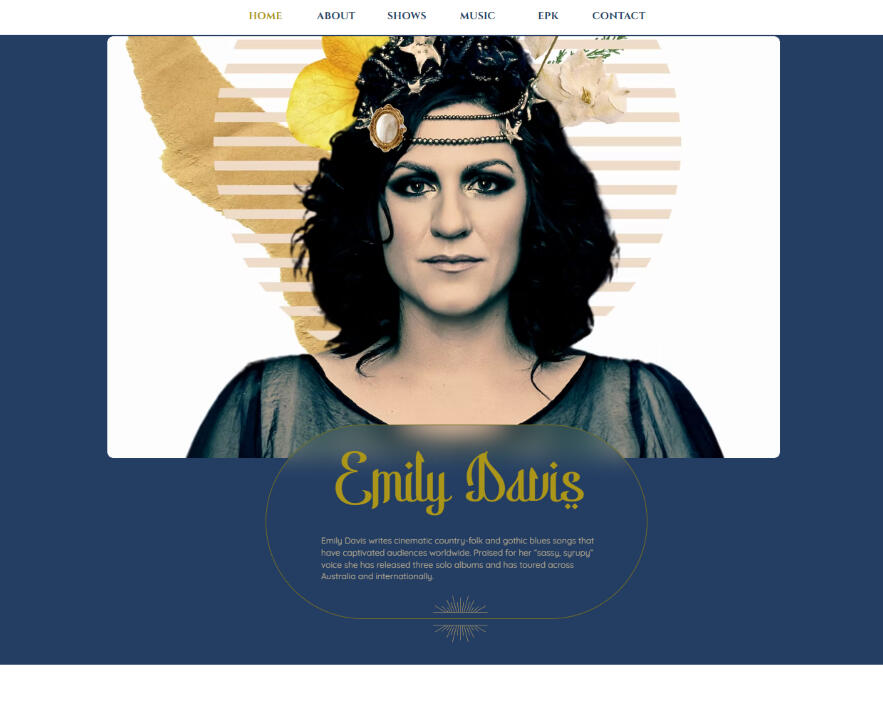
Emily Davis — Website refresh for a singer-songwriter
.
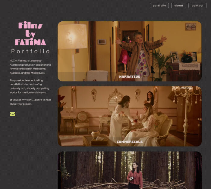
Films by Fatima — Filmmaker portfolio and visual identity
.
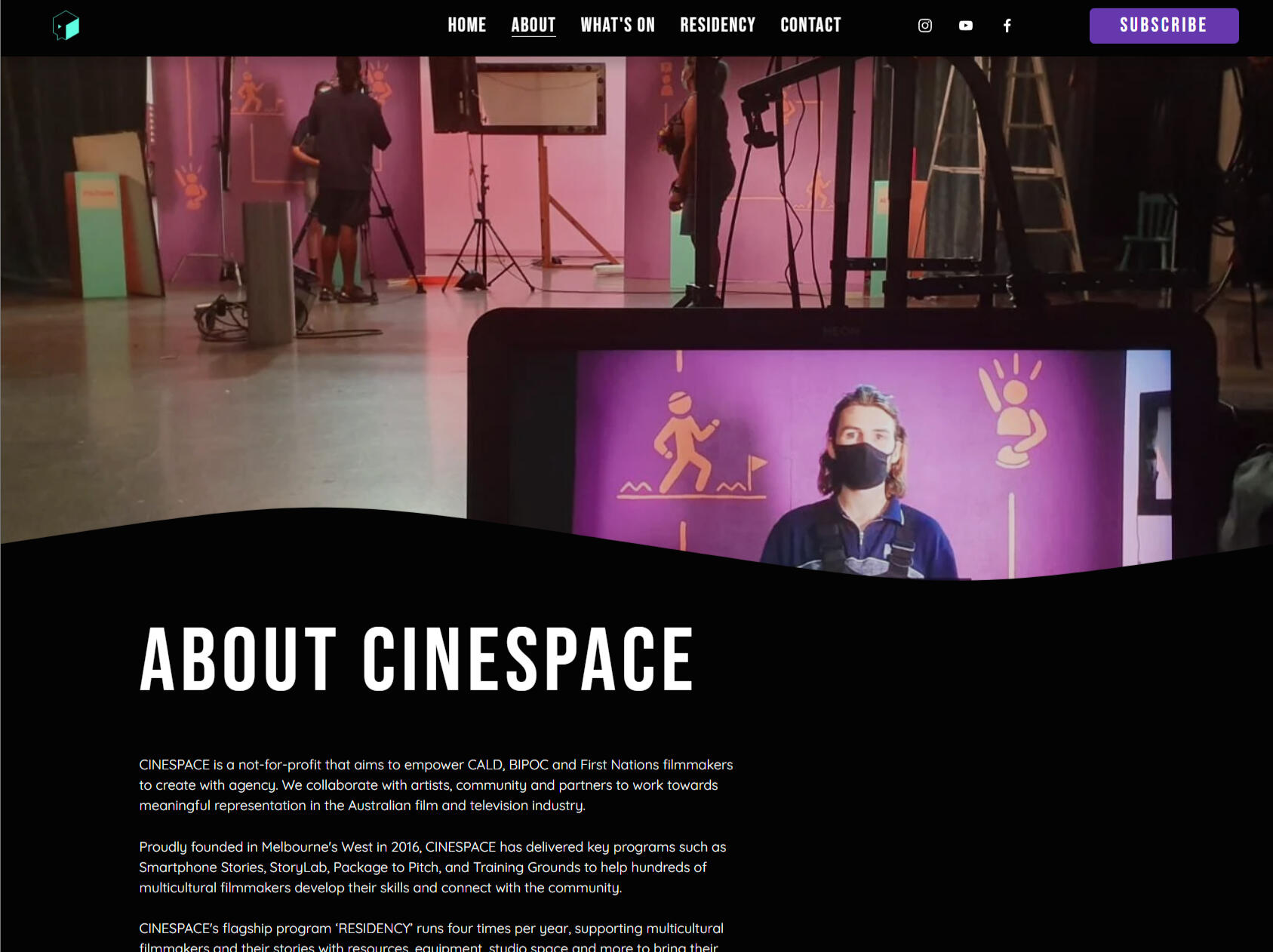
Cinespace — Not-for-profit rebrand and website, Melbourne
.
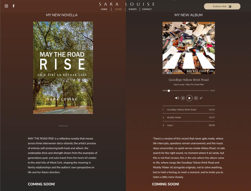
Sara Louise — Launch landing page for a vocalist, producer and author
.
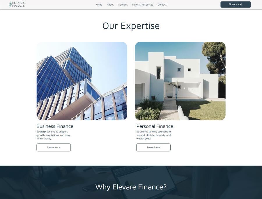
Elevare Finance — Brand identity and website for a new finance business
.
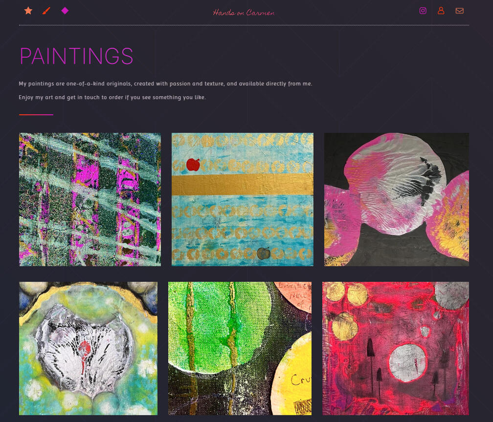
Hands On Carmen — Artist website and brand, Northern Rivers
.
Let's turn your vision into a memorable digital experience.
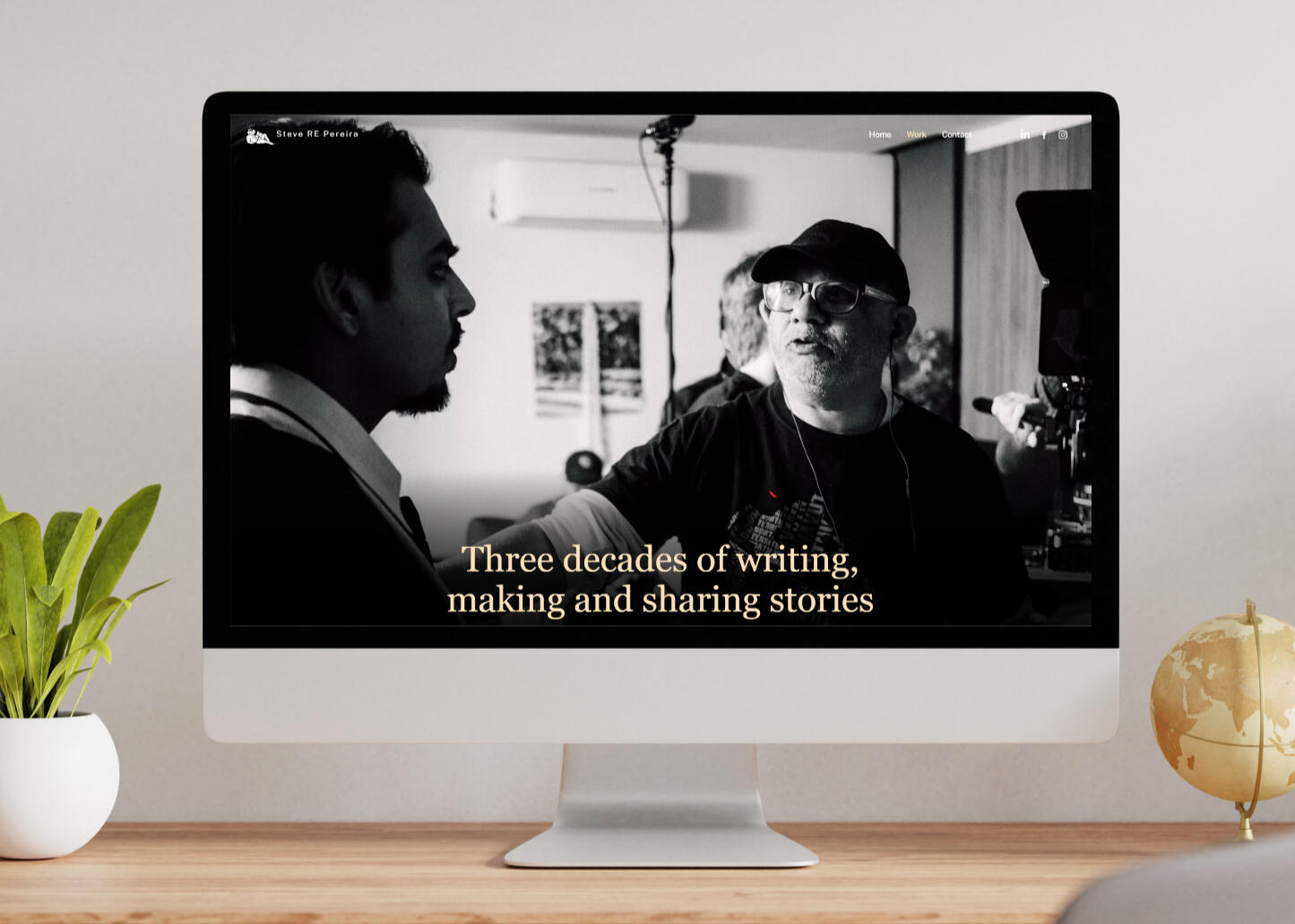
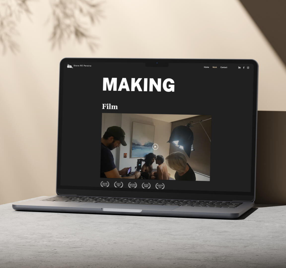
Steve RE Pereira —
Portfolio Website Redesign
From a 14-page archive to a focused, cinematic portfolio that matches the scale of his creative practice.
Client: Steve RE PereiraRole: UX Designer, Website Designer & BuilderTools: Figma, Wix,Project type: Website redesign & build
The Challenge
Steve RE Pereira is a writer, director and cultural producer with over three decades of work across film, theatre, literature and community practice. The problem wasn't a lack of content — it was the opposite.His existing website had grown organically over ten years, with new pages added project by project and no overarching structure to hold it together. Fourteen pages meant the navigation overflowed into a hidden "more" menu, making it almost impossible for a first-time visitor to understand what Steve did or where to start.The website felt like an archive rather than a portfolio — full of valuable work, but buried under its own weight.
Approach
The first task was to step back from the content and ask a simpler question: what does Steve actually do, and who needs to know?The answer shaped everything. His work falls naturally into three modes — writing, making, and sharing — and that became the backbone of the new site. Fourteen pages became three, with every project finding a clear home within that structure.The navigation went from overflowing to immediately legible.
From there, the focus shifted to letting the work breathe. I selected photographs that reflected the cinematic and literary character of his practice.For the Writing section, I designed a curated selection of three article cards — each with a teaser and image — to draw visitors in and send them to his Medium page with genuine curiosity.
Visual Identity
The palette is built around warm creams and sandy tones that feel unhurried and literary — like the pages of a well-read book. A muted slate blue anchors the stronger elements, adding depth without sharpness. Black is used deliberately in key sections, bringing a cinematic quality that reflects Steve's background in film and theatre.Typography pairs Georgia — a distinctive editorial display face — with Public Sans for body copy, keeping the reading experience clean and accessible while giving headings real character.
Before and After
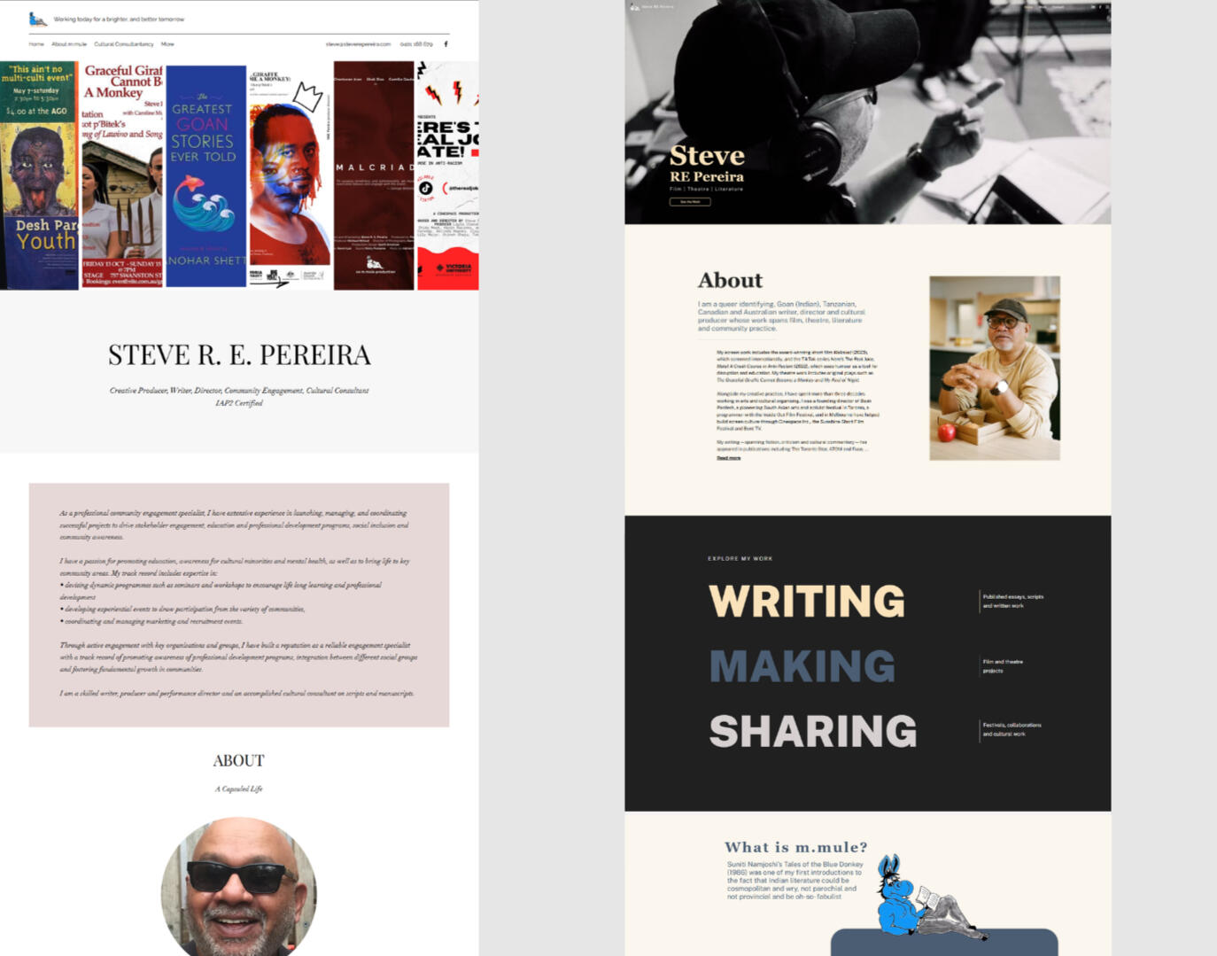
Results
What was once a ten-year archive is now a confident, focused portfolio.A visitor landing on Steve's site for the first time can understand who he is, what he does, and how to explore his work — within seconds rather than minutes.The visual direction gives the site a presence that finally matches the ambition and range of his creative practice.
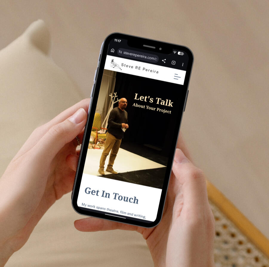
💬
"Working with Natalia on my website was a genuinely positive experience.What impressed me most was how quickly she understood exactly what I was trying to achieve. She took the time to understand my particular needs and came up with thoughtful suggestions that made the website much stronger than I had originally imagined. Her insights into the design, structure, and user experience really improved the final result.Natalia was professional, responsive, and a pleasure to work with from start to finish. I would have no hesitation in recommending her to anyone looking for a talented website developer who listens, communicates well, and delivers high-quality work.”STEVE RE PEREIRA, WRITER, DIRECTOR & CULTURAL PRODUCER
Is your portfolio a messy archive?
Let's untangle it and show your work at its best.
Cinespace —
Website Redesign
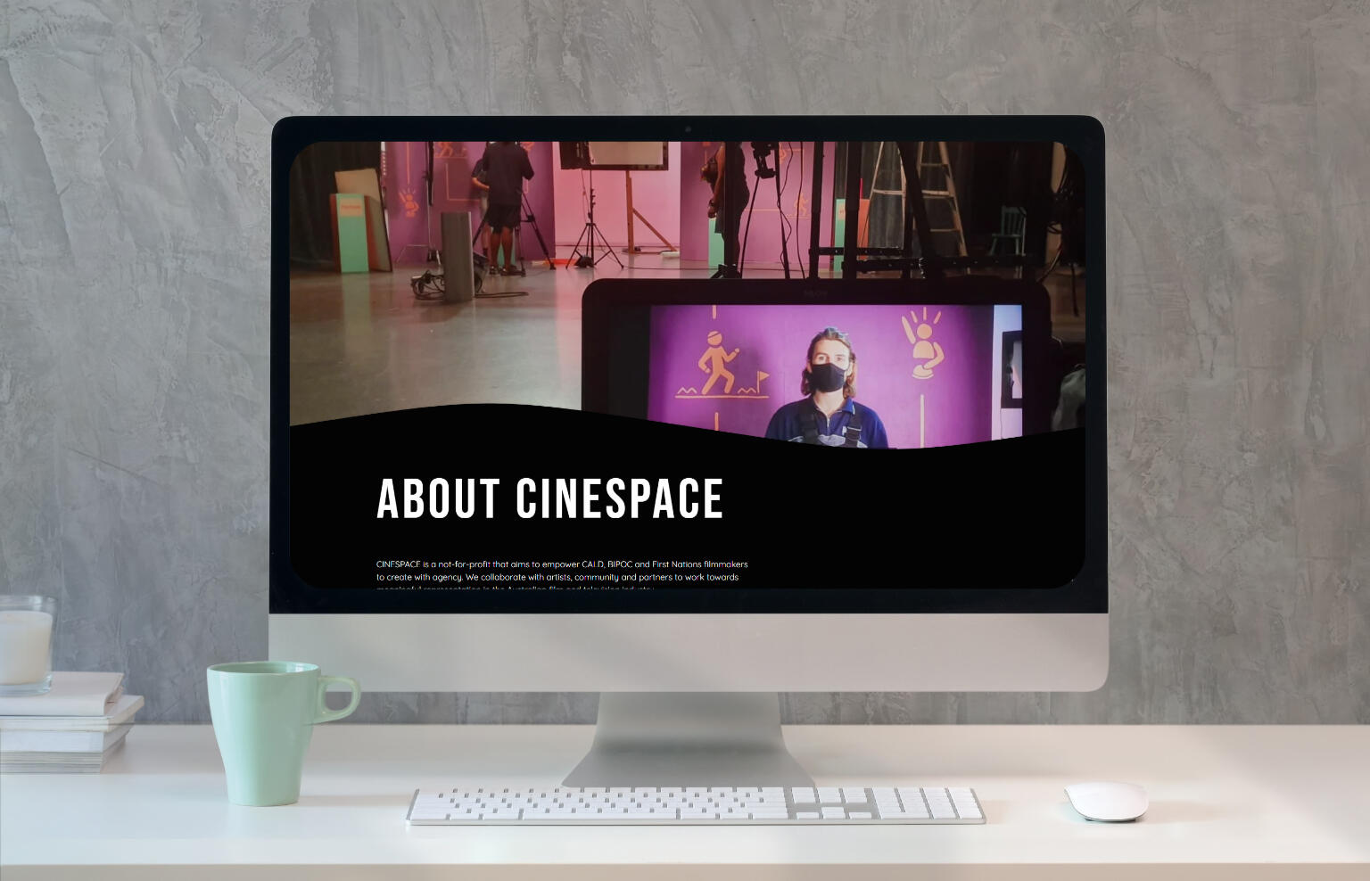
Repositioning a not-for-profit through a more cinematic, user-focused digital experience.
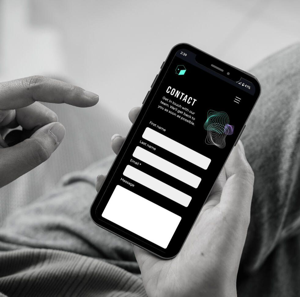
Client: Cinespace Inc.Role: UX Designer, Website Designer & BuilderTools: Figma, Wix, SquarespaceProject type: User research, website audit, UX design, website redesign & build
The Challenge
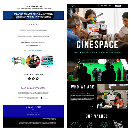
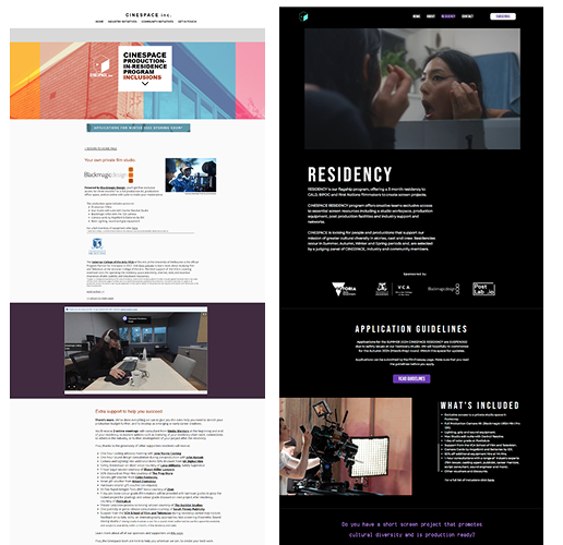
Cinespace, a not-for-profit supporting emerging multicultural filmmakers, needed a website that better reflected its mission and growing impact.The existing site lacked clear structure, consistent branding, and made it difficult for users to find information or engage with programs.The goal was to create a more cohesive, accessible platform that would support both discovery and participation.
Approach
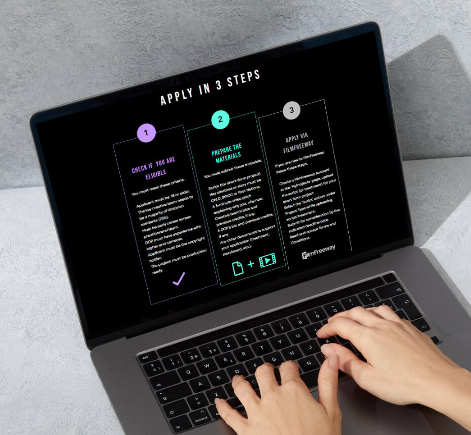
I led the redesign and rebuild from the ground up, working closely with a brand strategist and designer to ensure alignment across visual identity and user experience.The focus was on simplifying structure, improving navigation, and creating a more engaging, visually cohesive platform.New content, video integration, and a refined layout helped bring clarity to the organisation’s programs and strengthen its overall digital presence.
The Process
01. Research & Strategy
• Conducted interviews with new and returning users to identify key friction points
• Analysed usability issues including navigation, content structure, and information hierarchy
• Reviewed comparable organisations to identify opportunities for improvement
02. UX Design & Prototyping
• Restructured the site to prioritise key programs and improve user flow
• Developed wireframes and high-fidelity designs in Figma
• Created a flexible system to support future content and growth
03. Website Build & Launch
• Built the site in Wix with a focus on performance and ease of use
• Optimised for mobile and accessibility
• Delivered in time for the launch of the Residency Program
Before and After
Results
The redesigned website delivers a clearer, more engaging experience that better reflects Cinespace’s identity and mission.Improved structure and navigation have made it easier for users to explore programs and take action, while the updated visual direction strengthens the organisation’s credibility.The site launched alongside the Residency Program, supporting increased engagement from filmmakers, partners, and stakeholders.
💬
"Natalia recently completed a website build as part of our wider rebranding project for Cinespace.She was instrumental in leading, coordinating and bringing our vision to life. Her expertise carefully navigated visual design, user experience and effective communication of our story and has resulted in our stunning website today.She was organised and very easy to work with."PAULINE PHAM, CINESPACE, MELBOURNE
Time for a website redesign?
Let’s create a website that reflects your brand and supports your growth.
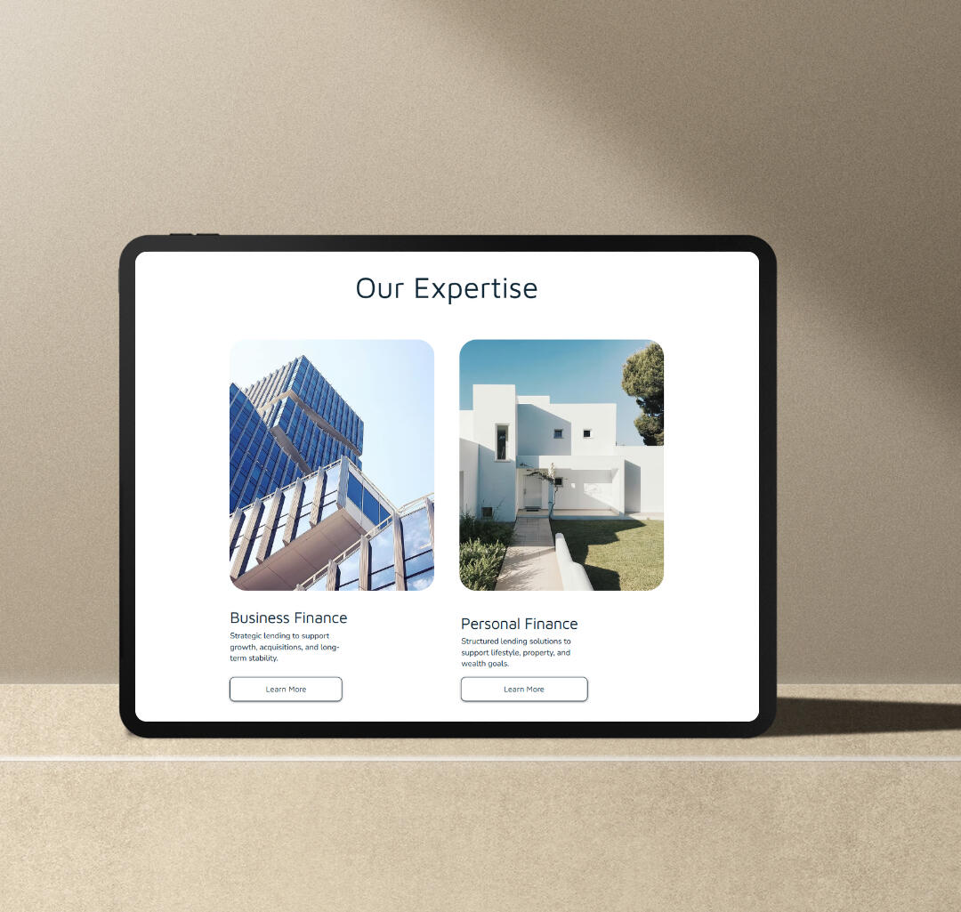
Elevare Finance —
Brand Identity & Website
Building a calm, confident brand and digital presence for a modern finance business.
Client: Elevare FinanceRole: Brand Designer, UX/Website Designer & BuilderTools: Figma, WixProject type: Brand identity, logo design, UX design, website design & build
The Challenge
As a new finance business, Elevare Finance needed a strong foundation for both its brand and online presence.The challenge was to create an identity that felt professional and trustworthy, while remaining approachable in a space that can often feel complex or overwhelming.The website needed to communicate services clearly, guide users intuitively, and support early-stage growth.
Approach
I developed both the visual identity and website as a cohesive system, ensuring consistency across brand and digital touchpoints.The focus was on clarity, simplicity, and balance—creating a brand that feels calm and professional, while designing a website that guides users through information with ease.Each element was designed to support trust, readability, and long-term scalability.
The Logo Concept
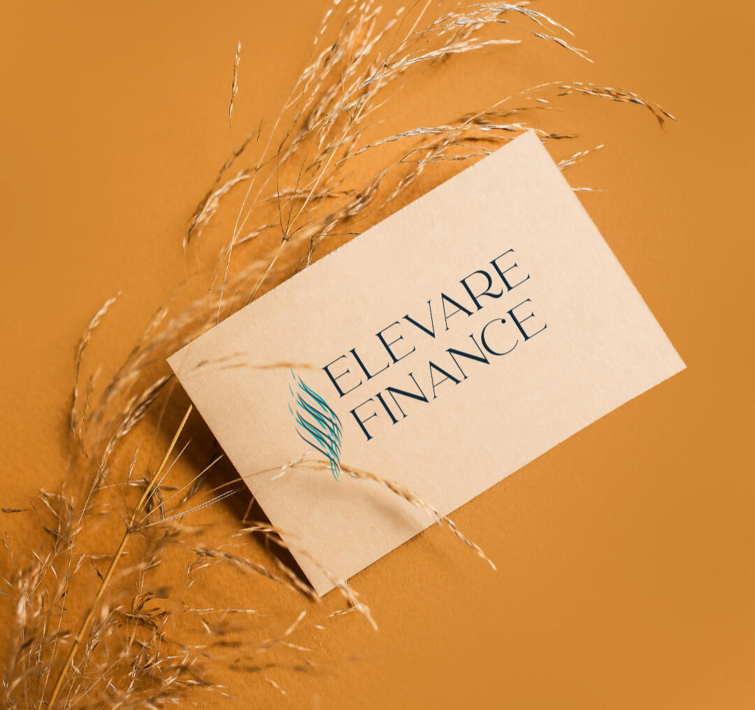
The Elevare logo combines a refined serif typeface with a flowing symbol to convey trust, clarity, and a modern, premium feel.The three upward waves represent growth and progress, while their smooth movement reflects the brand’s ability to simplify complex financial journeys.Their intersection speaks to collaboration between client, adviser, and lender, with a subtle gold accent adding a sense of quality and distinction.
Visual Identity
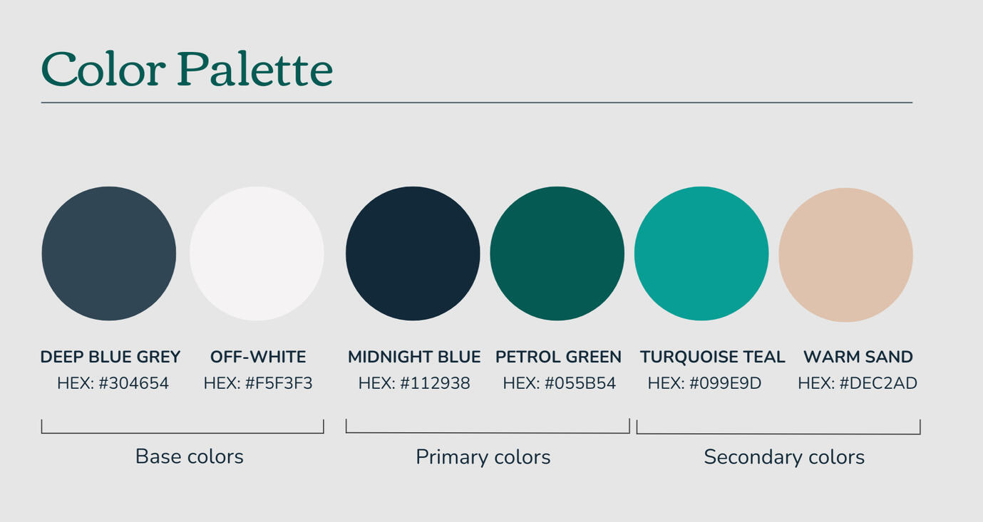
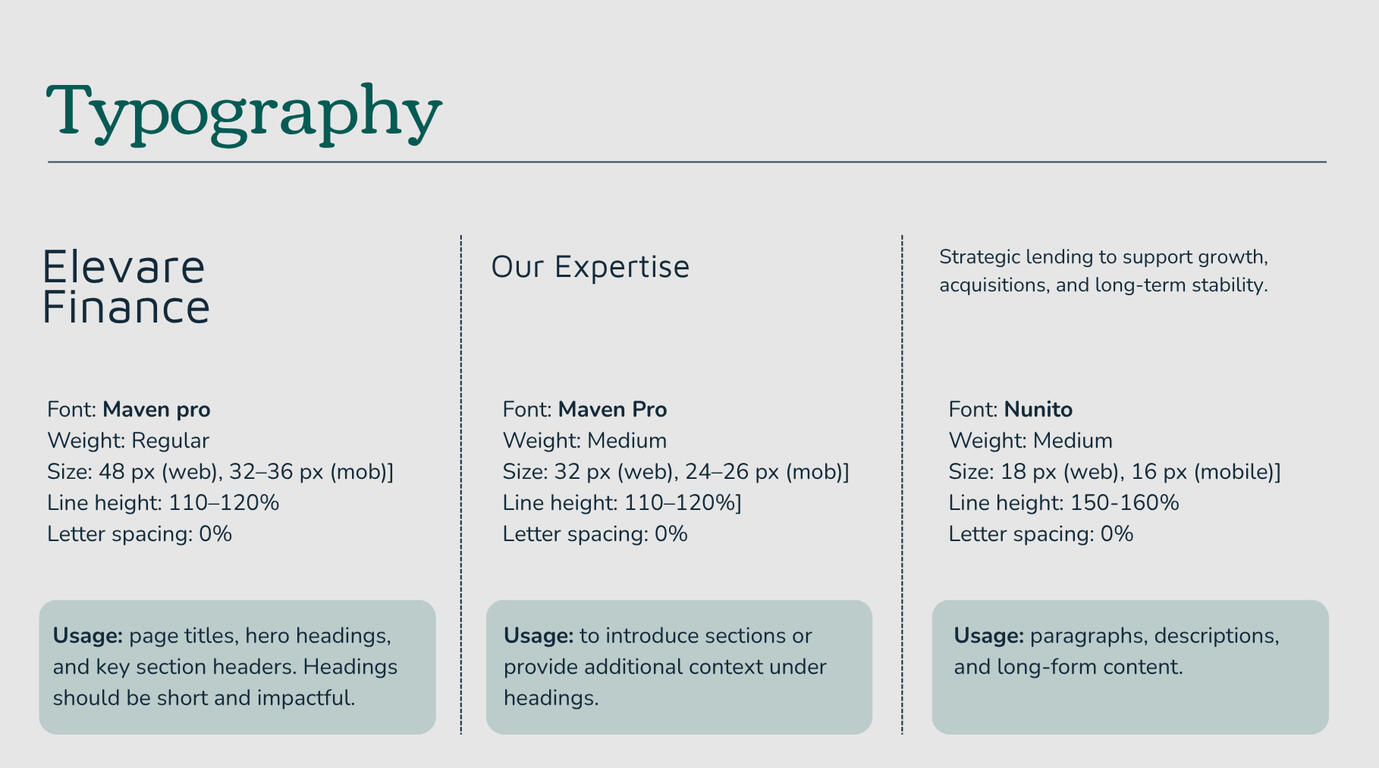
A minimalist palette of soft tones and refined typography creates a calm, confident presence across all touchpoints.The system is designed to be flexible and scalable, ensuring consistency across the website and future marketing materials.
Results
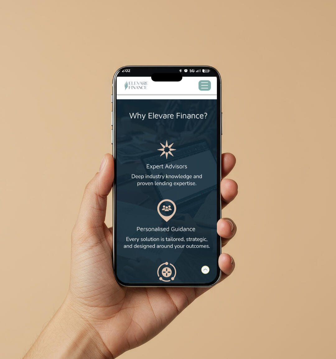
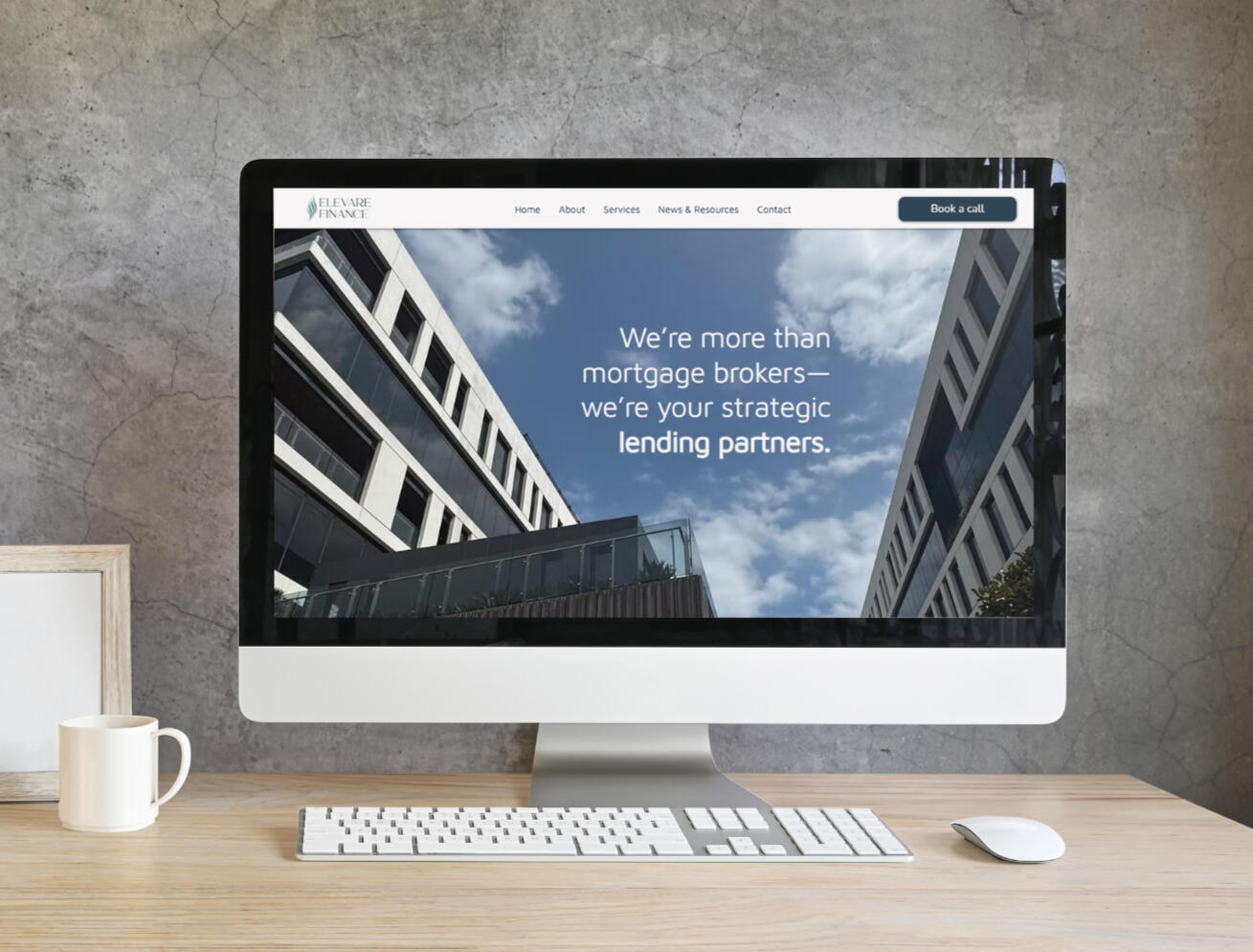
Elevare Finance now has a cohesive brand identity and a professional digital presence that clearly reflects the quality of its services.The website simplifies complex information, helping users understand the offering quickly while building trust through clarity and consistency.Together, the brand and website create a strong foundation for growth.
💬
"Nata has been an absolute delight to work with. When I approached NataDesigns, I had only a vague idea of what I wanted—other than a desire for a website that felt truly unique. Despite my limited direction, Nata worked tirelessly to bring possibilities to life through thoughtfully curated mood boards, themes, logos, and design concepts. She transformed ideas I couldn’t articulate into a cohesive, beautifully crafted vision. Her deep knowledge of design principles, user experience, and intuitive interaction shines through in every stage of her process."TRAN LE, DIRECTOR, ELEVARE FINANCE, MELBOURNE
Does your new business need a digital presence?
Let’s design a brand and website that work beautifully online.
Films By Fatima —
Portfolio Website Design
A cinematic digital portfolio for a filmmaker and visual storyteller.
Client: Films By FatimaRole: Brand Designer, UX Designer & Website BuilderTools: Figma, CarrdProject type: Logo design, visual identity, website design & build
The Challenge
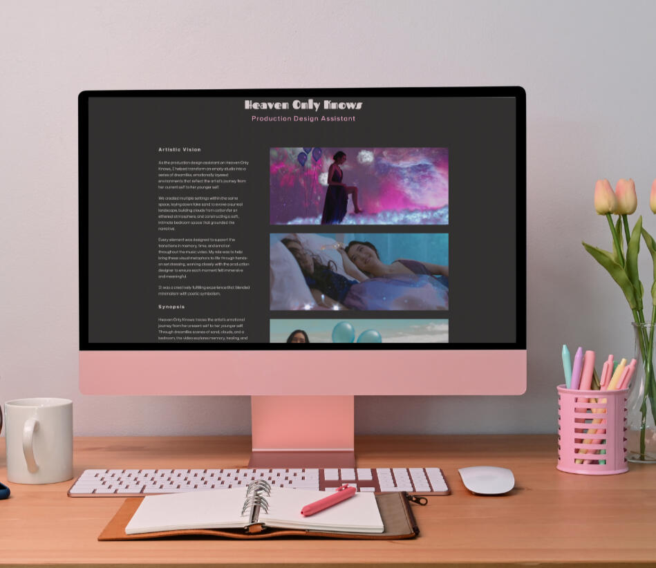
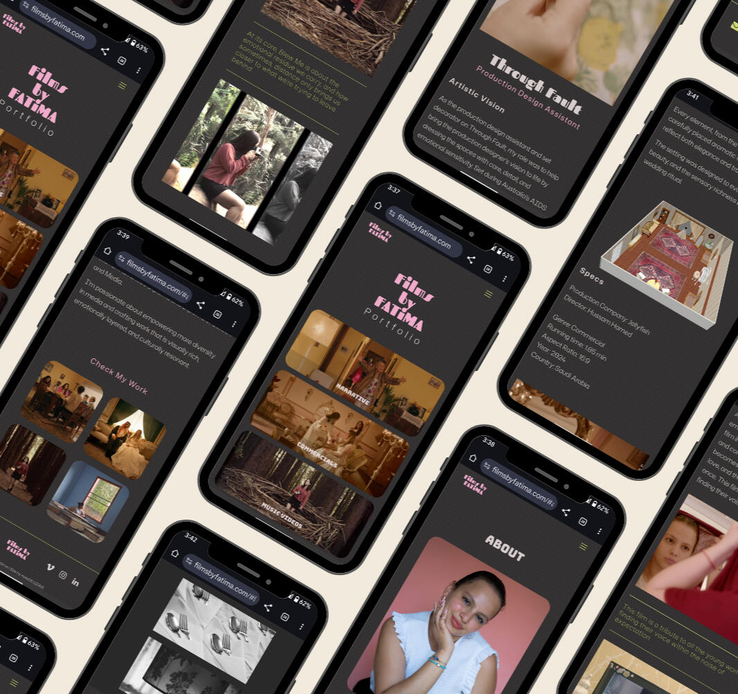
Fatima needed a digital home for her work that felt cinematic, cohesive, and true to her visual voice.The challenge was to showcase a diverse body of work—including narrative film, commercials, documentaries, and music videos—while maintaining clarity and strong visual storytelling.
Approach
I designed and built a cinematic portfolio website for filmmaker Fatima, focusing on visual storytelling, rhythm, and clarity.I also developed the logo and visual direction, defining a cohesive identity that shaped the entire website experience.The structure was designed to let imagery lead, supported by a minimal layout and intentional pacing that reflects the tone of her work.
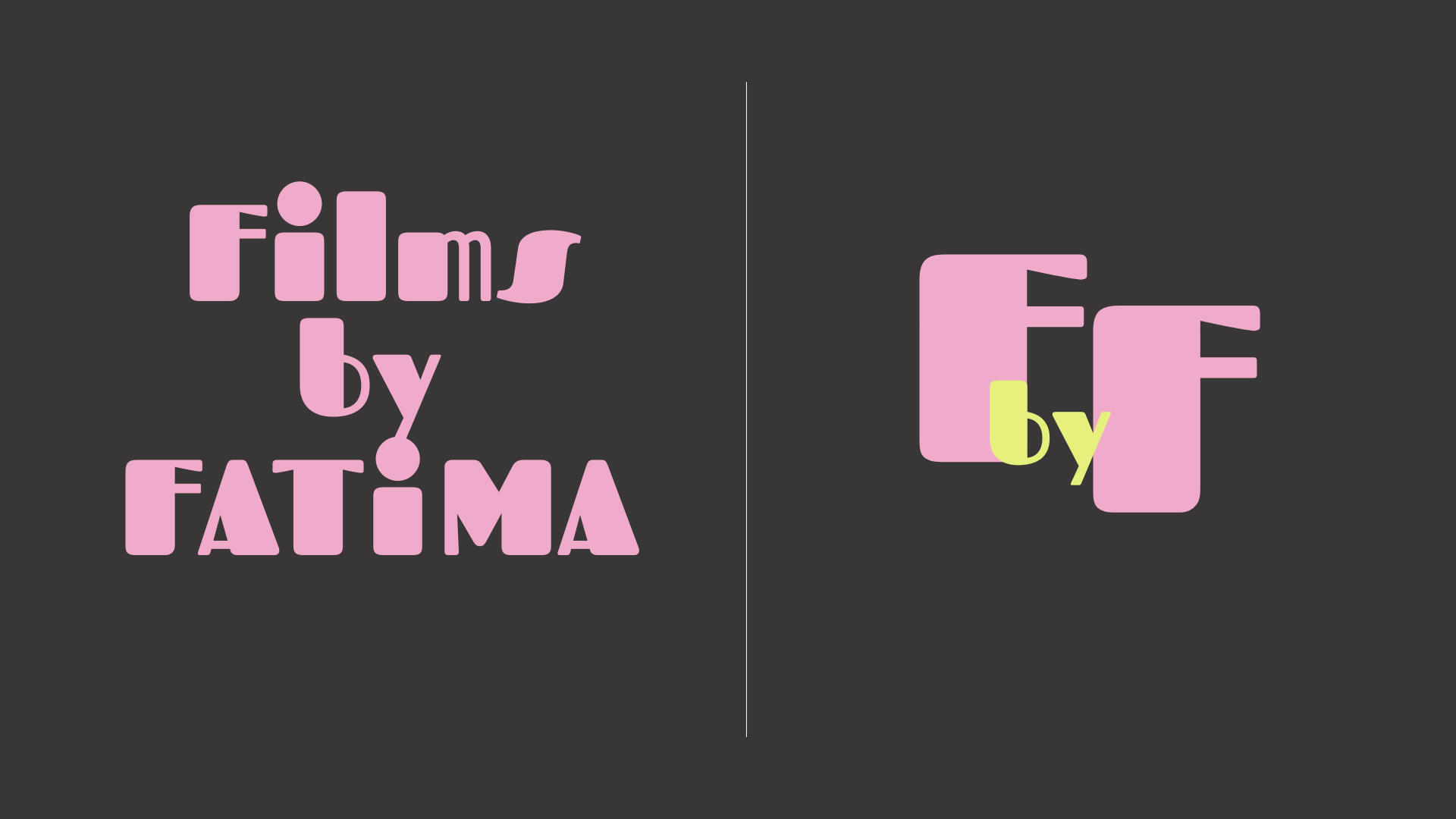
The Logo Concept
The logo for Films By Fatima was designed to reflect Fatima’s creative voice and the focus of her work in women-led film storytelling.The primary wordmark uses a rounded serif typeface with a mix of uppercase and lowercase letters, creating a balance between expressiveness and approachability. The soft forms and pink palette reinforce a feminine, cinematic tone that aligns with her visual identity.A secondary monogram version was developed for use across digital touchpoints, combining two “F” initials into a simplified mark. This version uses a yellow accent drawn from the website colour palette and functions as the favicon, ensuring consistency across platforms.
Visual Identity
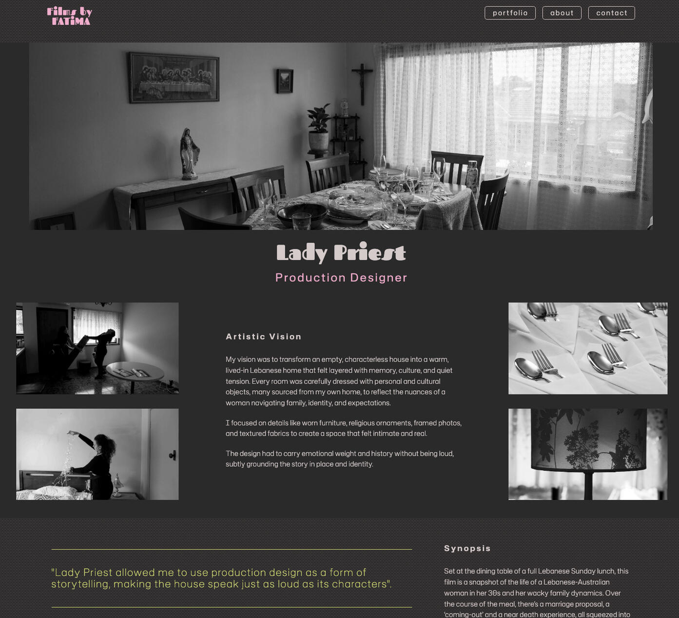
The website uses a dark, cinematic foundation to create depth and atmosphere, allowing the visuals to stand out.A soft but bold accent palette introduces contrast and personality, without distracting from the work itself.Generous spacing and editorial-style layouts create a sense of rhythm, echoing the pacing of film.
Results
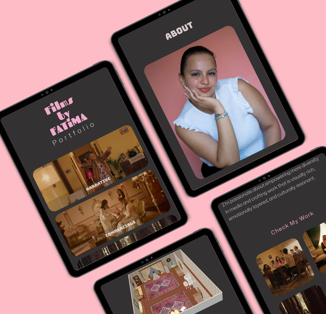
Films By Fatima now has a cinematic online portfolio that reflects her creative identity and visual storytelling approach.The website provides a clear and immersive way to present her work, making it easier to share with collaborators, clients, and industry contacts.Since launch, it has strengthened her professional presence and supported new creative opportunities aligned with her vision.
💬
"Working with Natalia was an incredible experience. She took the time to really understand my style and voice as a filmmaker and helped me build a website that beautifully represents who I am. From the start, she was so supportive, collaborative, and open to ideas and she made the whole process feel effortless and fun. The final result is something I’m really proud of, and I feel like my work finally has the online home it deserves."Fatima, Films by Fatima, Melbourne
Time to get your portfolio online?
Let’s craft a professional portfolio that gives your work the visibility it deserves.
Hands On Carmen —
Branding and Website Design
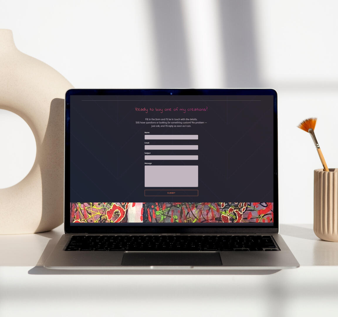
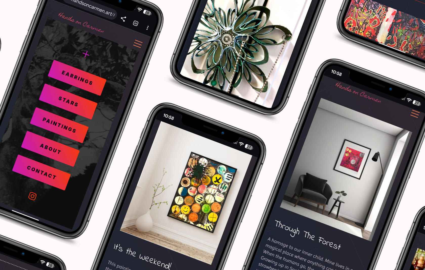
A vibrant digital gallery designed to showcase Carmen's upcycled art.
Client: Hands On CarmenRole: Web Designer / Visual Direction / Copy CollaborationTools: Figma, CarrdProject type: Logo design, visual identity, website design & build
The Challenge
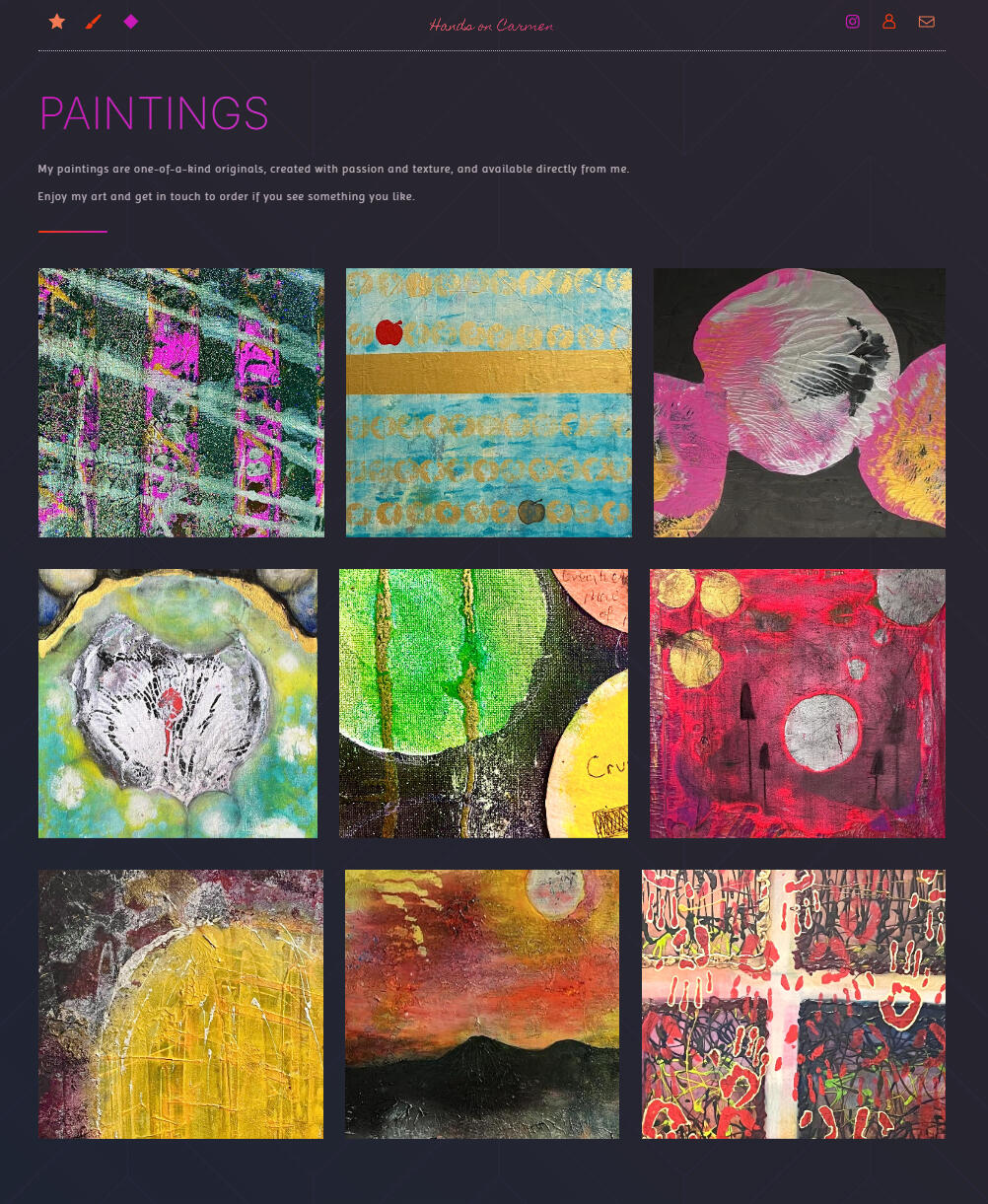
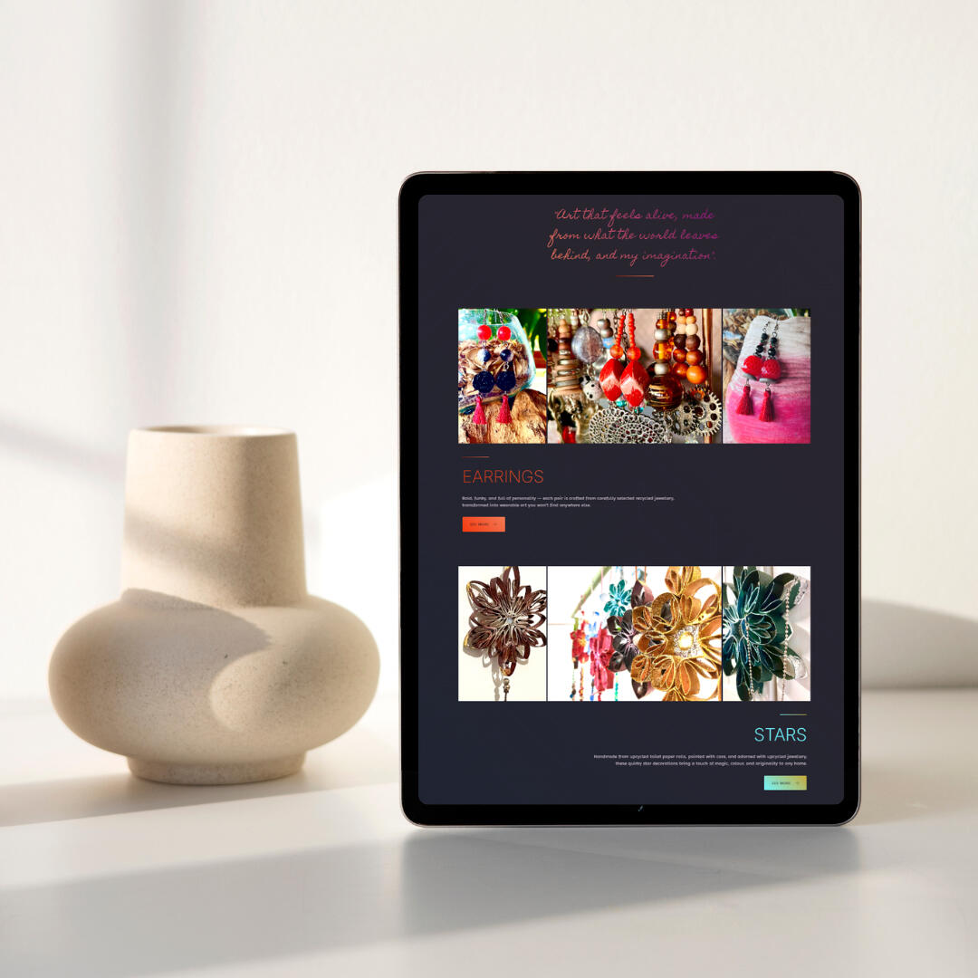
Carmen needed a website that captured the colour, creativity, and playful nature of her upcycled art practice. The goal was to create an online space where visitors could explore her earrings, star décor, and mixed-media paintings through a simple, gallery-style experience — while keeping enquiries and purchases personal through direct contact.
Approach
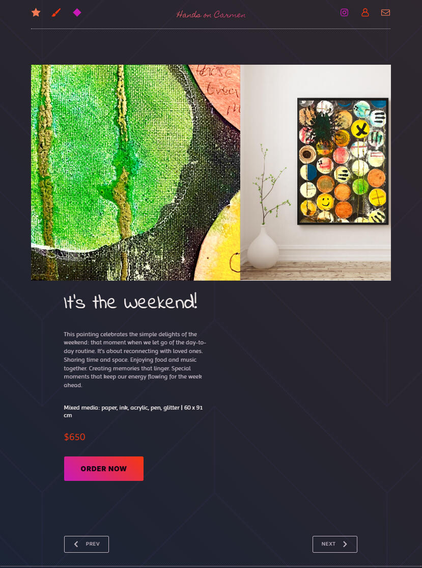
The website was designed as a bold, multi-page digital gallery that allows Carmen’s work to take centre stage. A dark background creates strong contrast against the vibrant colours and textures of her pieces, helping every collection feel expressive and visually distinct.The overall direction balances playful colour with clean layouts, creating an experience that feels artistic without becoming overwhelming. Alongside the visual design, I also collaborated closely with Carmen on the website copy — shaping her story, personality, and creative process into clear, engaging messaging.
Visual Direction
The visual identity embraces contrast, colour, and experimentation — reflecting the handcrafted nature of Carmen’s work and her sustainable approach to art-making.Design Highlights
• Bold colour palettes against a dark background
• Gallery-inspired layouts with generous spacing
• Expressive UI elements with an artistic edge
• Collaborative storytelling woven throughout the copy
The User Experience
The final website feels energetic, creative, and approachable — much like Carmen herself. Clean navigation keeps the browsing experience simple, while the bold visual direction gives the site a memorable personality.Each section was designed to let the artwork breathe, helping visitors focus on the detail and individuality of every piece while making it easy to explore collections and enquire directly.
Results
Hands on Carmen now has a distinctive online presence that reflects the creativity behind the brand while providing a more professional platform to showcase and sell her work.The website extends her reach beyond local markets and creates a digital experience that feels just as vibrant and handcrafted as the artwork itself.
💬
"Natalia has done an amazing job putting my website together and captured me and my artwork perfectly.
She helped me refine the copy across the whole site, made me see my paintings in a different light, and created beautiful mockups to present my work at its best.I couldn’t recommend her more to anyone looking for a collaborative and creative web designer."Hands On Carmen, Northern Rivers, NSW
Need a digital home for your art?
Let’s create a website that reflects your style, tells your story, and helps your work reach more people.
Emily Davis —
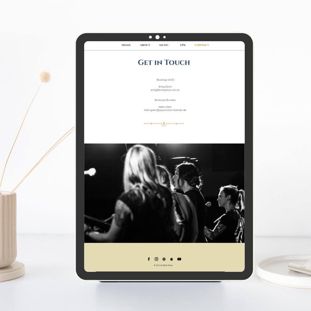
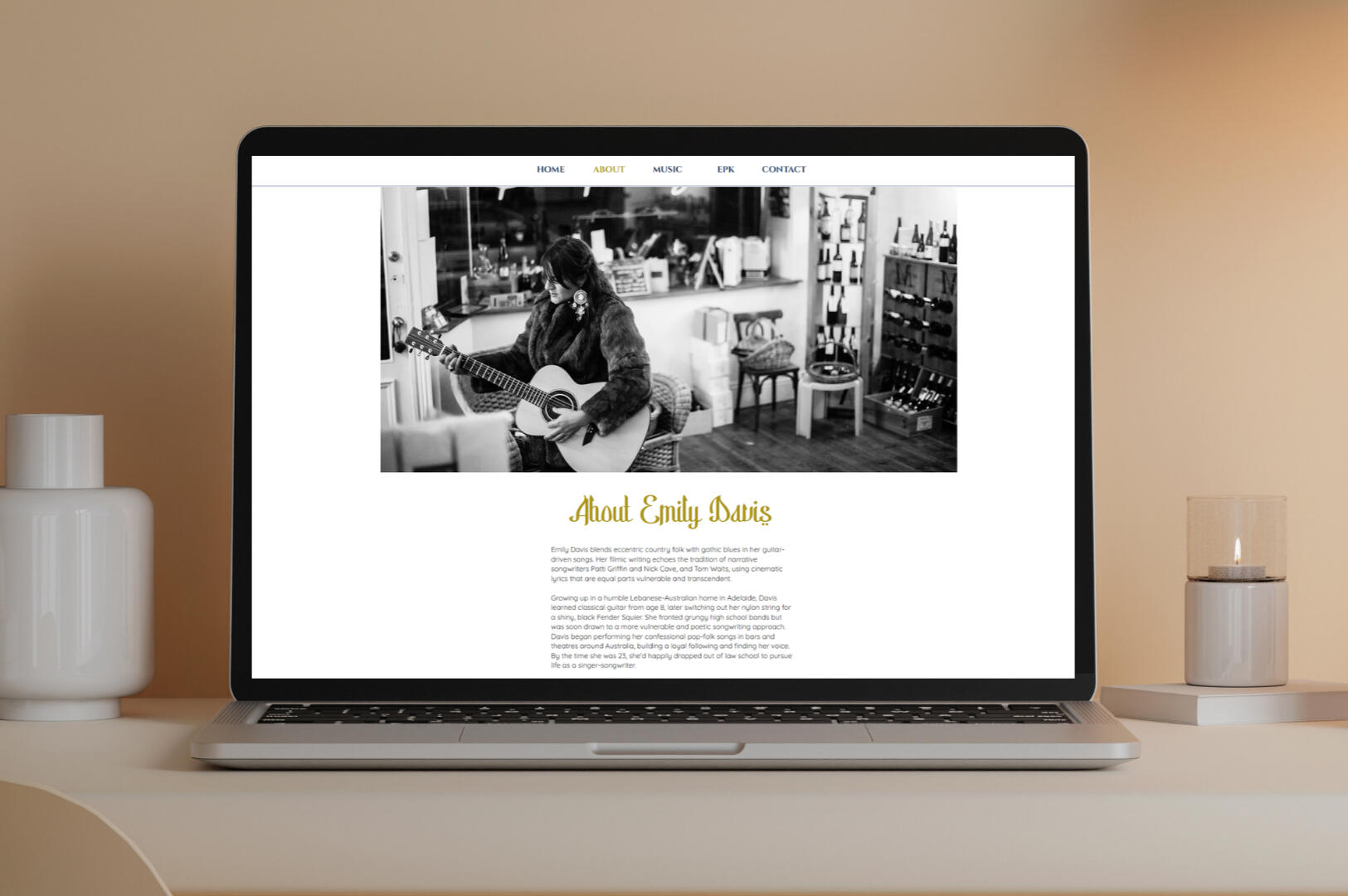
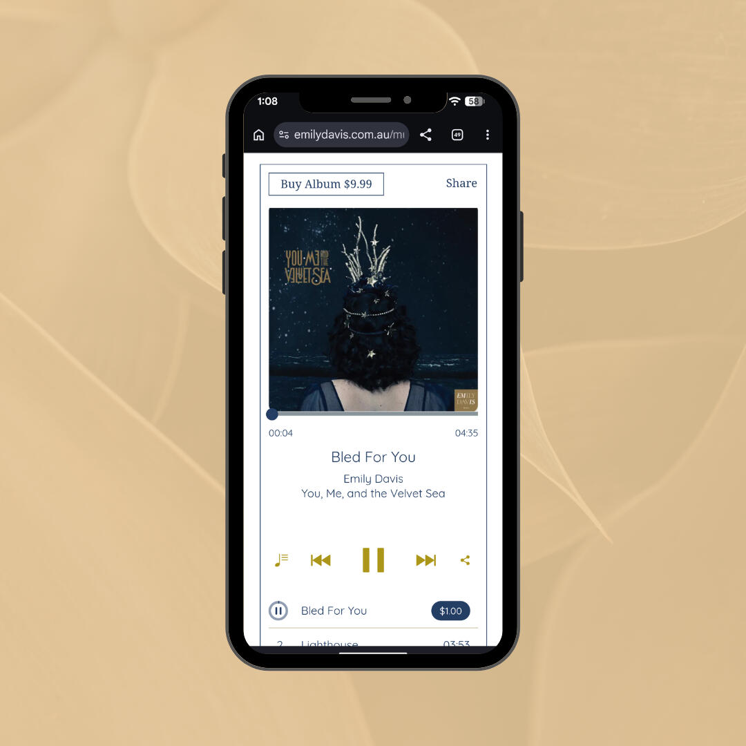
Website Refresh
A cohesive visual refresh that lets Emily's music and story take center stage.
Client: Emily DavisRole:Visual Direction & Website RefreshTools: WixProject type: Website refresh, visual identity refinement, UX restructuring
The Challenge
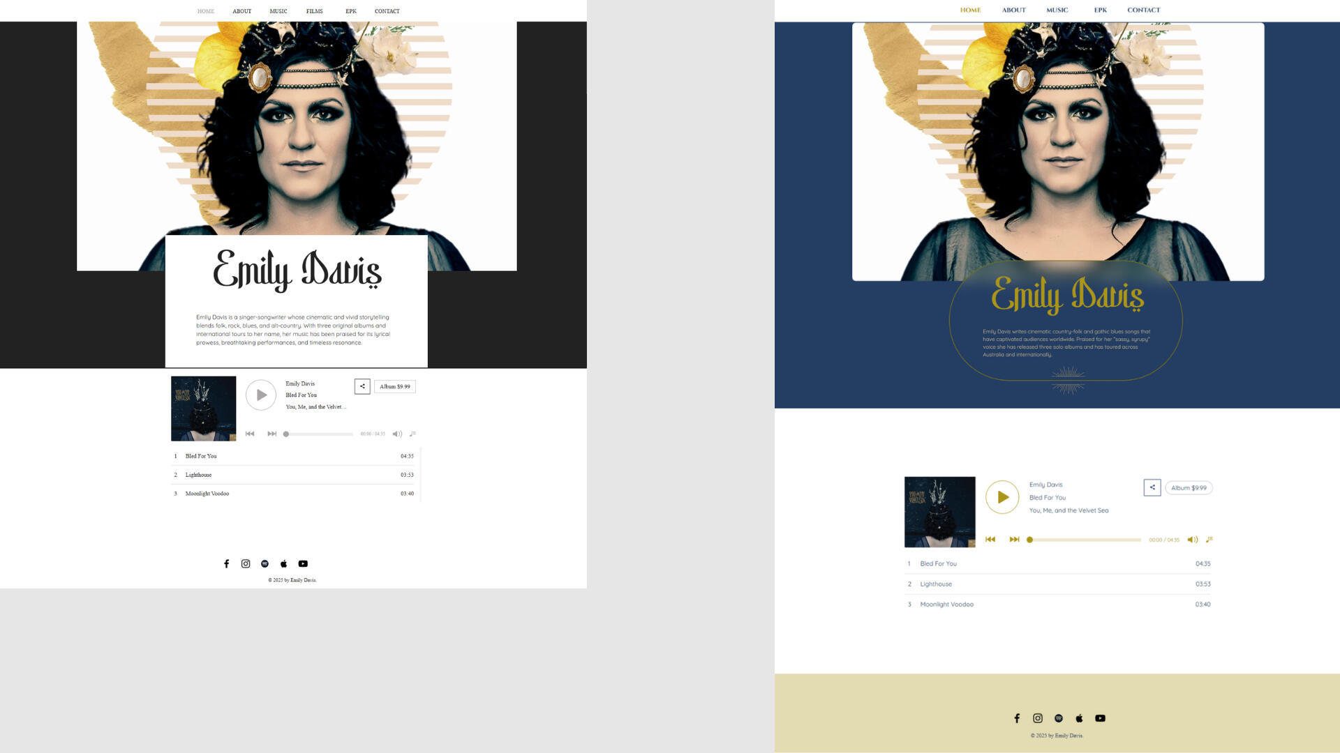
Emily had already built her site on a Wix template — strong bones, great photography, her voice clearly there. What a template doesn't give you is a single eye pulling it all together: the palette, type, and navigation had drifted page to page, so the overall feel didn't quite match the strength of what she'd already built.
Approach
I kept what already worked — her striking hero photography — and built a single, confident direction around it. A deep navy and gold palette, pulled straight from that image, now runs through every page, paired with type and ornamental details that echo the moody, cinematic edge of her music. Stripping back the noise and leaving generous white space lets her music and imagery do the talking, with a clearer path guiding visitors straight to listen or find her next show.
Visual Identity
The palette is built around a deep navy and warm gold, lifted directly from Emily's own photography rather than introduced from scratch — keeping the refresh true to her existing brand.A refined serif carries the headings, paired with a flowing gold script for her name that now appears consistently as a signature element across the site.
Design Highlights
• Navy and gold palette drawn from her own photography
• Custom gold ornamental dividers that echo her headpiece in hero image
• Generous white space to let the music lead
• A clear, restructured path to "Listen" and "Shows"
Before & After
Results
Emily now has a site that feels as considered as her music — cohesive, confident, and easy to navigate. It's a clean, professional presence to share with venues, press, or booking agents, with an obvious path to her music and upcoming shows from the moment someone lands on the page.
Time for a website refresh?
Let's give your digital presence a stunning new look.
The MAY Brandworks
Landing Page
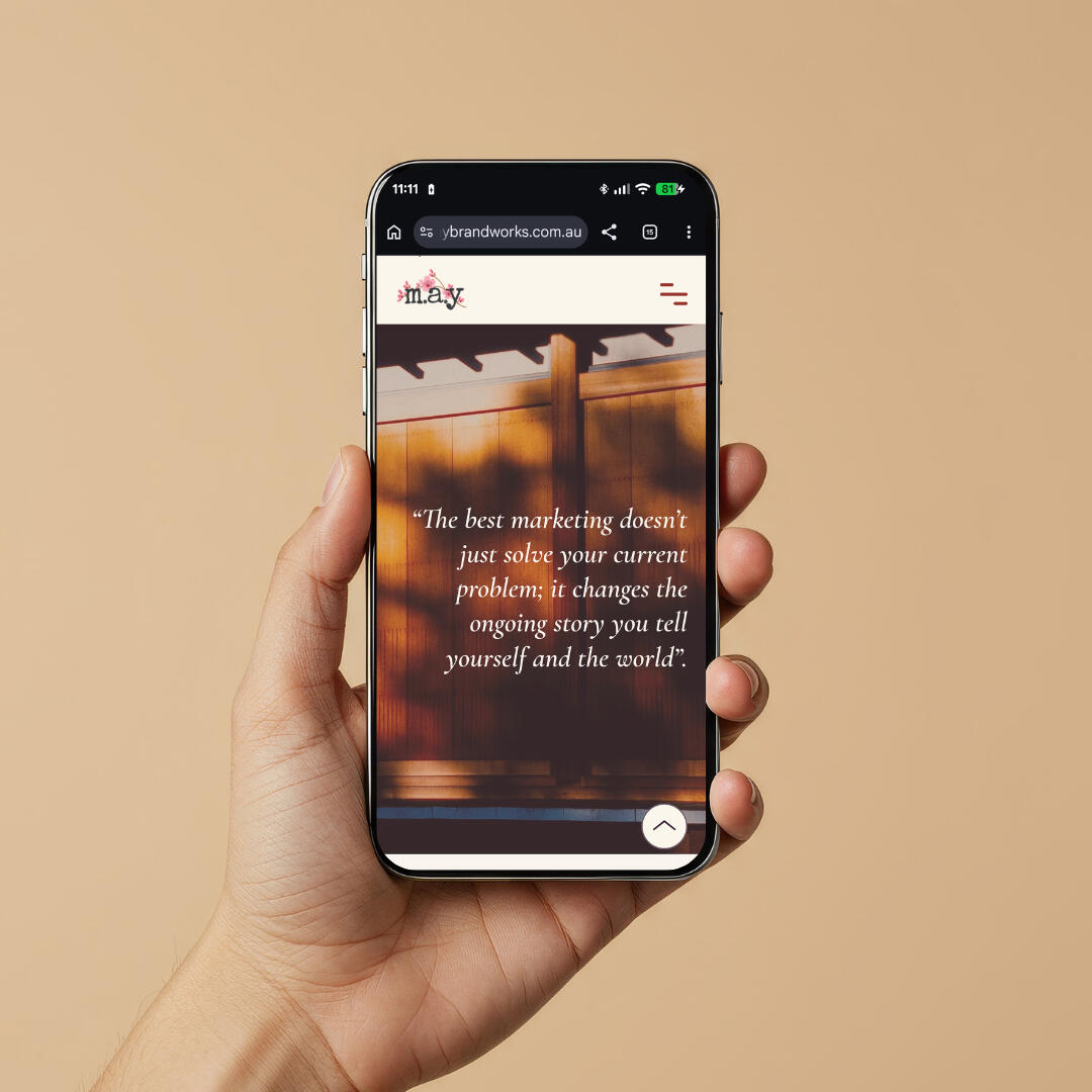
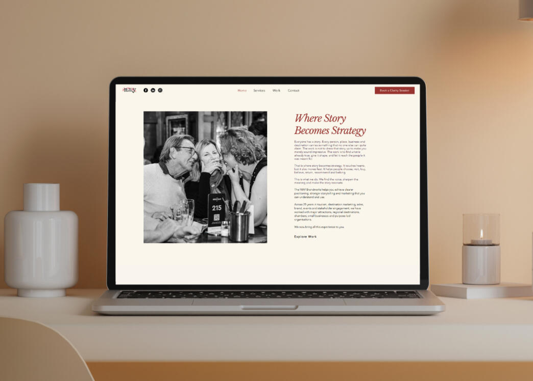
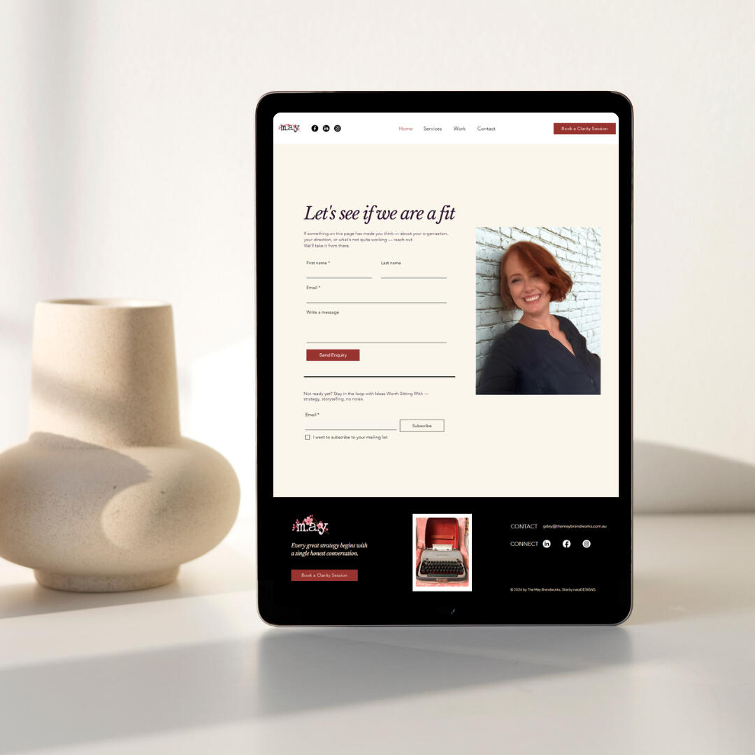
A premium, editorial landing page designed to position a strategic consultant for high-value clients.
Client: The MAY Brandworks — Sara AngRole: UX Designer, UX Designer & Website BuilderTools: Figma, WixProject type: Landing page strategy, wireframing, UX design, website design & build
The Challenge
Sara Ang is a strategic brand consultant with 25 years of experience in tourism, destination marketing and stakeholder engagement. As a returning client, she came back to nataDESIGNS with a bigger brief — a landing page that would position The MAY Brandworks for a more selective, premium client base of directors, councils, tourism operators and founders.The challenge was to build something that felt as considered and strategic as the service itself — without looking like every other consultant site.
Approach
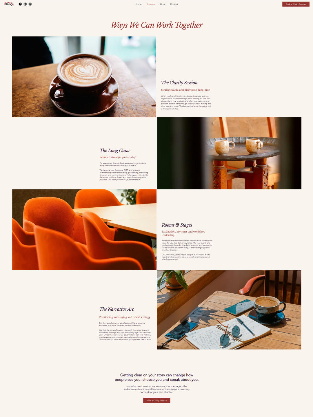
The design is built around an editorial direction: generous white space, warm typography, and a restrained use of her brand palette — letting the copy and imagery carry the story rather than competing with it.Every section earns its place. The services are presented as an alternating editorial layout rather than a card grid. The case studies tell real client stories with real Australian imagery. The testimonials feature one single powerful testimonial. And the contact section closes with an invitation rather than a form.
Visual Identity
The palette draws from Sara's existing brand — deep red, terracotta, blush and cream — used as accents rather than blocks. The red appears in CTAs and headings, while the warm cream runs as a consistent backdrop throughout.Typography pairs Cormorant Garamond Italic — elegant, literary, unhurried — with Avenir Light for body copy, creating a contrast between personality and clarity that mirrors Sara's own positioning.
Results
A focused, conversion-driven landing page that positions The MAY Brandworks as a premium strategic consultancy — distinctive, confident, and ready for the clients Sara is built to serve.
💬
“Finding Nata for this project was such a pleasure.There are so many generic, off-the-shelf designers out there, and so much instant sameness, that finding someone who can work with both speed and genuine creative instinct feels like a real discovery. Nata is that person, and I could not recommend her more highly.”Sara Ang, The MAY Brandworks, Sydney
Need a similar landing page?
Let’s build a conversion focused website tailored to you.
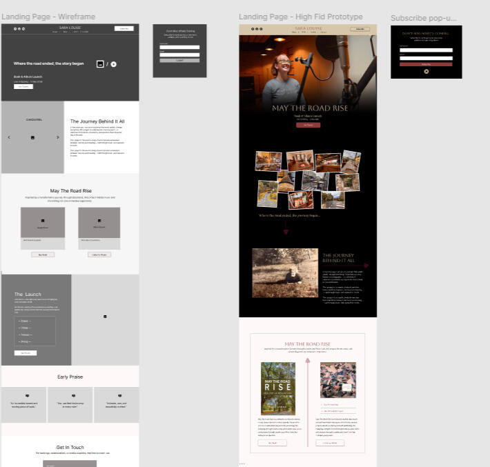
Sara Louise —
Landing Page
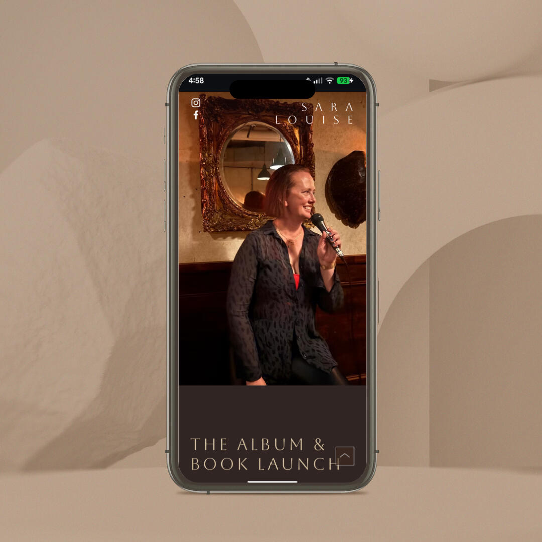
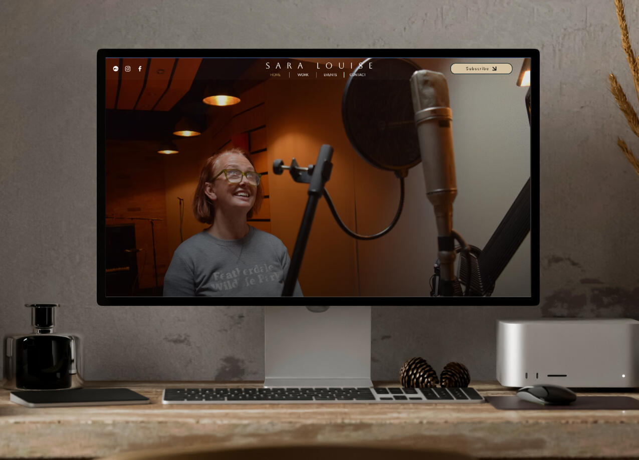
A refined, approachable landing page design to reflect Sara Louise's artistic identity.
Client: Sara LouiseRole: Brand Designer, UX Designer & Website BuilderTools: Figma, WixProject type: Visual identity, website design & build
The Challenge
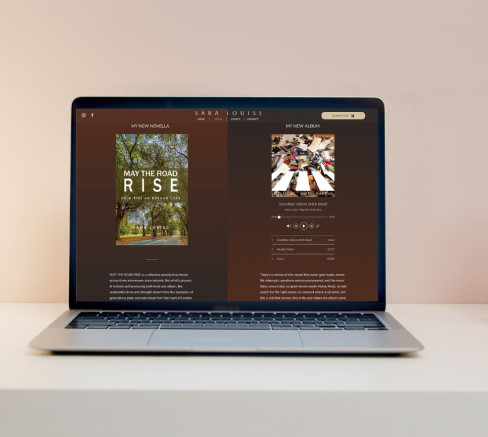
Sara Louise is a singer-songwriter launching a new creative project combining music and writing.The goal was to design a strategic landing page that supports her upcoming launch while also functioning as a long-term platform to promote her work, attract bookings, and grow her audience.
Objectives
• Promote the book and album launch
• Drive ticket sales
• Encourage newsletter sign-ups to capture leads
• Position Sara Louise for future gig bookings
• Create a flexible structure that can evolve beyond the launch
Visual Identity
I established a strong visual system that feels elegant, distinctive, and expressive.The typography pairs a refined display font for headings and the artist’s name with a clean, readable sans-serif for body text, creating a balance between personality and clarity.Inspired by tones present in Sara’s photography, the colour palette combines deep reds, golds, and black—bringing a sense of richness and elegance while maintaining warmth and accessibility.The website integrates imagery from Sara’s personal journey, grounding the experience in authenticity and emotion.To create a cinematic sense of depth and flow, I incorporated layered scroll interactions, allowing content to gradually reveal and move across background imagery.

Results
A versatile, story-driven landing page that:• Supports the immediate launch campaign
• Positions Sara Louise as a professional, bookable artist
• Encourages audience engagement and lead capture
• Can evolve over time without requiring a full redesign
💬
“Finding Nata for this project was such a pleasure. MAY THE ROAD RISE and my other creative work are labours of love, the kind that demand a rare and sensitive instinct to bring to life visually. Nata has exactly that.”Sara Louise, The MAY Brandworks, Sydney
Need a similar landing page?
Let’s build a conversion focused website tailored to you.
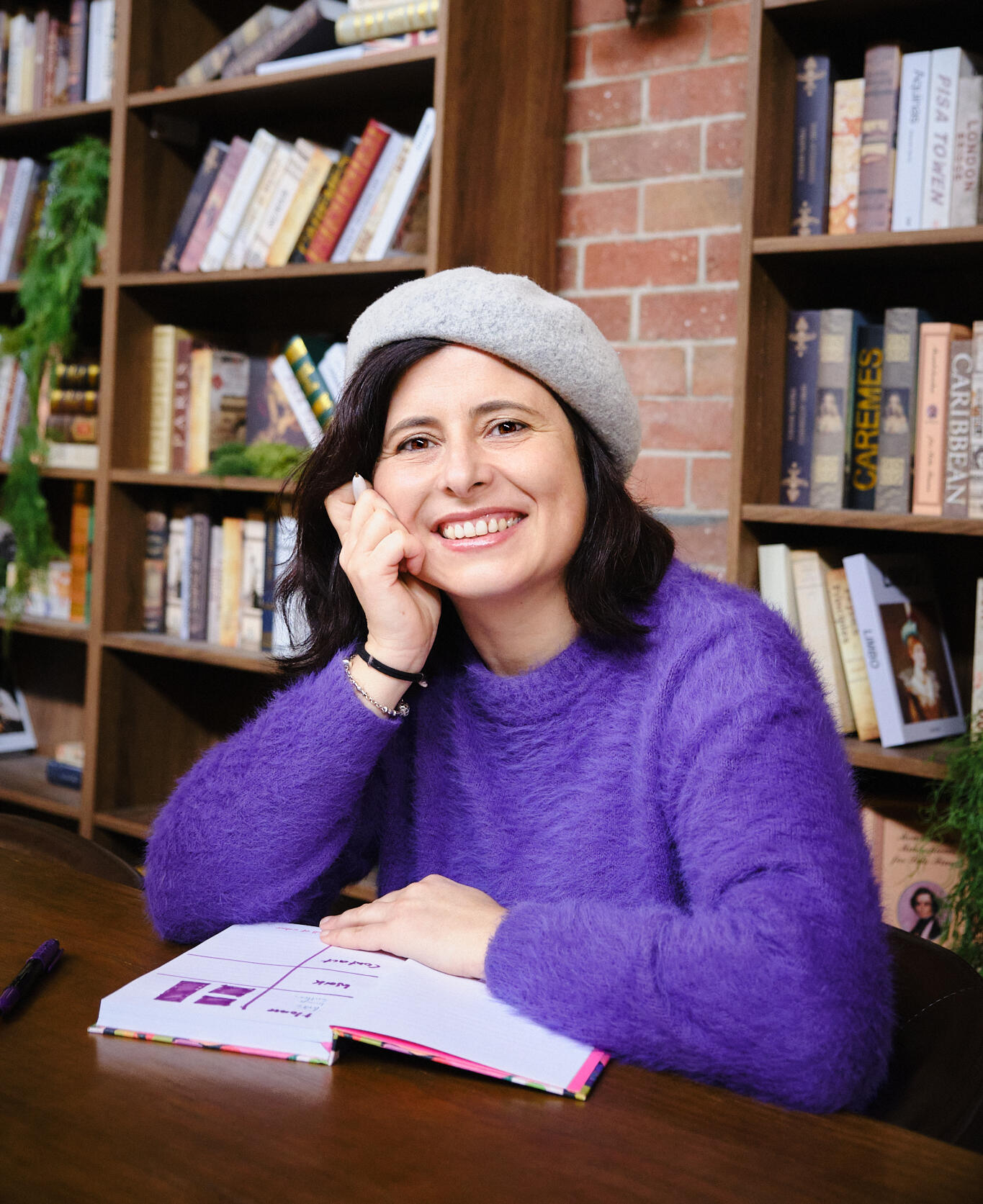
Hi, I’m Nata.
Web designer with UX & film background. Based in Melbourne
I help creatives, founders, and storytellers bring their ideas to life online. I design websites that reflect your voice, your vision, and the people you want to reach.Because the process can feel overwhelming, I keep things clear and collaborative. Together, we shape your ideas into a visual direction that represents your brand.
Where strategy meets storytelling
I design with both emotion and intent.My UX background shapes how people move through a website—what they expect, how they navigate, and what makes them stay.Combined with a cinematic eye, the result is cohesive, intuitive, and engaging.
Beyond digital
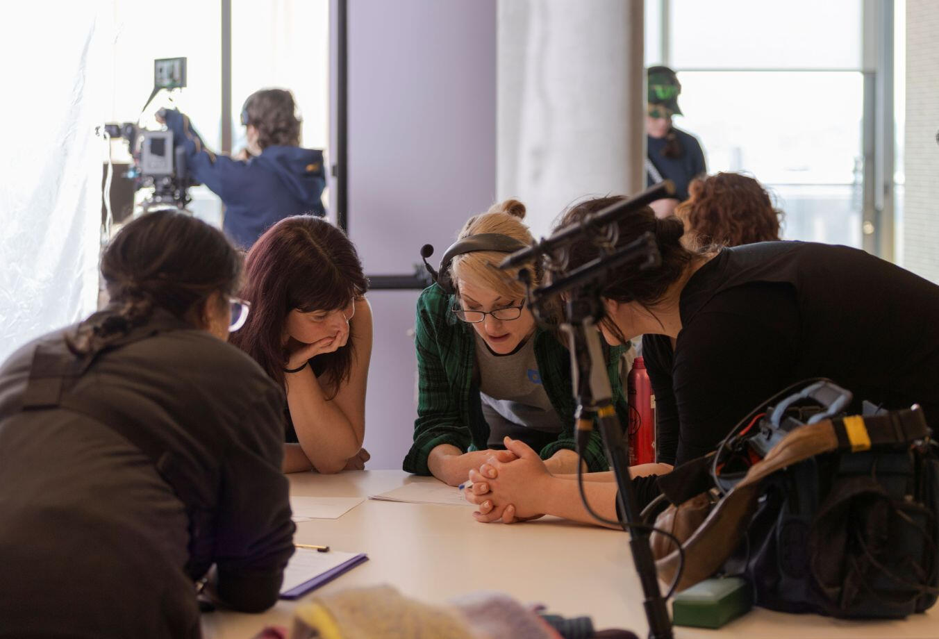
Alongside my design work, I co-run a film production company developing women-led stories.It’s where my approach to storytelling, pacing, and visual composition comes from—and it naturally carries into my design work.The result is a more collaborative, cinematic feel across everything I create.
💬
"Working with Natalia was an incredible experience. She took the time to really understand my style and voice as a filmmaker and helped me build a website that beautifully represents who I am.”Films by Fatima, Melbourne
Ready to bring your vision to life?
Get In Touch
Tell me about your project, your goals, and where you want to take your brand.I'll be in touch within 1–2 business days to book your free 30-minute strategy call.